Archive for the ‘digital’ Category

Guardian drops Berliner failure for tabloid in redesign

January 15, 2018
Guardian redesign 2018

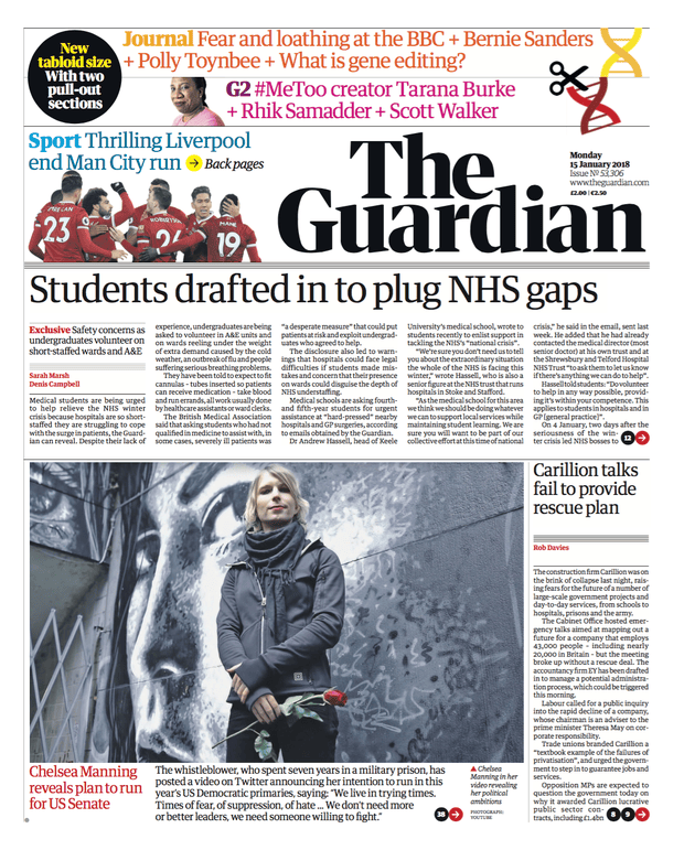
Today’s relaunched Guardian comes in 3 sections. Sport returns to the back page – led by Liverpool’s thrilling victory over Manchester City. The 2012 redesign had  Man City beating Wigan above its masthead. The paper was the Manchester Guardian until 1959 and moved to London in 1964

The Guardian downsizes today, switching from the Berliner format to tabloid. It’s the end of an experiment that began 12 years ago with a massive £80m investment, and has been forced on the paper to save money. Being the only British paper to use the Berliner format,  it had to build new print halls in London and Manchester with specially commissioned presses.

The weekday paper now has three sections:

  • main section: news, politics, international affairs and financial news with sport starting on the back page;
  • a new, pullout opinion section called the Journal. This will carry the columnists, long reads, obituaries, letters and the cryptic crossword;
  • G2, the features-based section.
Promotional video for the new look by the Guardian 

The Guardian claims a great design history, based on its breaking new ground in 1988 with an approach developed by David Hillman, a Pentagram founder who made his name on Nova in the 1960s. It had already dropped the ‘hang and drop’ approach favoured by the other Fleet Street broadsheets in favour of modular layouts. The other broadsheets’  focus was on getting as many stories and words on a page as possible. The Guardian wanted to differentiate itself for readers.

The 1960s newspaper design guru Allen Hutt gave way to Harry Evans and then Hillman introduced a grid system with lots of white space around the headlines at the Guardian. Alongside the white space, most striking element on the front page was the dual font title, with the ‘The’ in ITC Garamond Italic and the butted-up ‘Guardian’ in Helvetica Black. Nothing new for a magazine, but a first for a British newspaper.

The design industry liked it; the reaction in much of Fleet Street was: ‘art holes’! There was also a lot of negative reaction internally at the Guardian as fewer stories were carried and copy length was cut.

These internal complaints from editors were exacerbated when the paper’s second section dropped from a broadsheet to a tabloid in 1992 – at a stroke, story lengths had to be cut by a third. That is not an obvious effect, but is the result of a number of factors: headline sizes stayed the same; pictures stayed the same size or even got bigger; each tabloid page needed as much margin space around the edges as each broadsheet page; more ‘signposting’ to features in the rest of the paper.

It has been a similar tale with every redesign since for all the papers since: more white space; bigger pictures; fewer stories, fewer words.

September 2005 saw the move under editor Alan Rusbridger and designer Mark Porter to the Berliner mid-size format – along with the need to buy a new set of expensive printing presses that were unique in Britain. The switch took three years and the paper described itself as a ‘factory’. In January 2012 the paper design and format was changed again ‘to reflect changes in news consumption’.

Today marks the Guardian giving up on its expensive Berliner experiment and following the Independent and Times down the tabloid route they took in 2003. Of course, the quality papers don’t like the ‘tabloid’ label, because it is associated with the more downmarket Sun, Mirror, Mail and Express, which adopted the format decades ago.

The other change alongside design is that the print agenda is now dictated by online data and readerships. What the likes of the Guardian don’t appear to appreciate as they quote digital readerships is that the online audience is heavily influenced by non-paying US readers. The news agenda becomes more US-influenced, moving the paper away from the home audience all the time.

Robert Harling, the long-serving editor of House & Garden and typographical adviser to the Sunday Times railed against the Continental modular magazine design approaches in the Times Literary Supplement with an article entitled ‘Poor old words’ (1972). His redesign of the cover for Wisden’s Cricketers’ Almanack in 1938, with its Ravilious engraving of Victorian cricketers, is a typographic classic. For Harling, the likes of Hillman’s Nova was dominated by ‘pictures and type-patterns subduing the words on every page’. The approach was ‘a menace to the freedom of the printed word’.

A features spread in the Berliner format Observer. It could have come from a magazine 30 years ago. The picture is the size of a tabloid page

A features spread in the Berliner format Observer. It could have come from a magazine 30 years ago. The picture is the size of a tabloid page and the text only occupies a quarter of the page area

Yet that approach became mainstream in magazines and Hillman brought it to the Guardian in a process of magazinisation. Photo-reduce many newspaper spreads today and they appear strikingly similar to the sort of designs in the 1960s in Town and Nova (which had been heavily influenced by Continental design, particularly Germany’s Twen). ‘Poor old words’ said Harling. Poor old readers too.

The Guardian‘s sister paper, the Observer, will go tabloid on Sunday. The switch was seen as step too far for the two papers in 2005, with staff fearing that changing to tabloid would damage the paper’s character. Those fears have been swept aside now as the need to save several million pounds a year bites.

The redesign features a new font, Guardian Headline by Commercial Type, the foundry that created Guardian Egyptian for the Berliner redesign. The main text font stays the same, no surprise given how much the 2005 relaunch cost.

And cutting costs is what has driven the changes. Expect to see lots of mentions of ‘150 million’ readers each month, but at the end of the day, most of these are browsers and bear no comparison in revenue or commitment to the value of a print reader. Money – getting enough of it is the big problem for the press.

British newspaper profiles


To see almost 500 magazine covers and pages, look out for my book, A History of British Magazine Design, from the Victoria & Albert Museum, the world’s leading museum of art and design


Google’s plan for a future city is terrifying

October 20, 2017
Schmidt, Trudeau and pals set out their plans for a 12-acre site on Toronto's waterfront

Schmidt, Trudeau and pals set out their plans for a 12-acre future city on Toronto’s waterfront

We started thinking about all the things we could do if someone would just give us a city and put us in charge

That has to be one of the scariest sentences I have ever heard. Why? Because it was said by Eric Schmidt, the billionaire chairman of Alphabet, the company set up to own Google.

This is the mega-tech company that sent its camera cars around around our roads – without anyone’s permission – and just happened to identify everyone’s open wifi while it was at it.

Google then ignored its own promise not to track people using the private windows in their browsers, and it has been found guilty of using its massive online power to force out smaller rivals by putting its own products first in search results. In simple words, that’s lying and cheating. No wonder the EU slapped Google with a €2.4bn fine.

Yet no-one except China, the US and the EU is big enough to stand up to the likes of Google/Alphabet, Apple, Facebook, Amazon, Ebay and their pals. The Schmidt quote comes from a report in the FT on Thursday (‘Toronto offers Alphabet waterfront land to practise designs for cities of future’ by Leslie Hook). He was talking at a publicity event with Justin Trudeau, Canada’s prime minister.

The FT piece points out that there is a ‘political backlash against big tech in the US, where politicians are grappling with the growing influence of Alphabet, Facebook and Amazon’. However, these mega-techs just play the global field and look to wield their influence with individual countries such as Canada or the UK for their schemes.

My reaction to the FT story is no doubt influenced by my efforts to do something very simple with Apple this morning. This mega-tech set its stall out with the launch of the first Mac way back in 1984. It forced all software makers to adopt its interface or it would not give them access to developers’ kits – even those that already sold software for Apple’s micros. The result was that many of the thriving small software companies in Britain turned to PC technology, or give up.

The level of control is incredible. I booked an appointment at an Apple dealer in the Strand, London, to see if I could get my Macbook power supply cable repaired (and I note as I type this that WordPress tries to cap up the ‘b’ in Macbook, another example of Apple’s Ratking-like power). I walked in and handed over the broken power supply. (How can they get away with such shoddy products – in almost 40 years of owning computers, I have never had a power cable break.)

‘What’s the serial number of the Mac?’ they asked. I didn’t know, which meant that they couldn’t do anything! They then sent me over to the Apple shop in Covent Garden. It was like walking into a youth club full of ping-pong tables. I eventually found a rack of products and a new power lead was £79! I asked about getting it repaired and was sent to join a dozen-strong queue for the one person in the room who could (perhaps) answer the question.

I gave up. I decided to pay up. And, of course, I had to find someone who has the portable device to pay. And then wait again while they printed the receipt out. I left with a massively overpackaged product, having been frustrated in my attempt to repair ought in an inefficient shop staffed by 90% men. Clearly, Apple is a company at the forefront of the world’s waste problems and at the back of the field in attempts to encourage women into the workforce.

They and their mega-tech ilk want a world in which they can track you and everything you own. Their futuristic city (for a waterfront-living elite) will be very efficient with huge political clout. Alongside it will be a licence to take a cut of – in essence, tax – the world’s media use, of books, film, TV, software. And 3D printing technology will enable them to do the same for many other products too.

If George Orwell hadn’t had Stalin’s Russia to inspire him to come up with 1984 and Big Brother, then Google and Apple wold have done it for someone else today – or perhaps it is the mega-techs that are modelling themselves on that dystopian, fascist world.

New Scientist sale is good news for Relx investors

April 15, 2017
New Scientist magazine front cover

New Scientist magazine has been sold for an undisclosed sum

The sale of New Scientist magazine is seen as good news for Relx, an Anglo-Dutch company that has moved from print to online delivery of information in the past 20 years.

The FTSE 100 company was once known as Reed International, and owned paper making and building materials companies such as Crown Paint and Polycell. It then bought IPC Magazines and book publishers and switched its focus to publishing. In 1993, it merged with Elsevier, a Dutch group, to concentrate on academic and professional publishing.

Reed Elsevier sold off both the consumer books and IPC’s consumer magazines, which were seen as low-margin businesses, to concentrate on digital delivery of data and information to academia and business. It held on to trade and business magazine titles, such as Variety and New Scientist, but has spent the past 10 years selling these to invest in digital assets such as Lexis Nexis.

Now, New Scientist has been sold to Kingston Acquisitions, an investment firm led by Sir Bernard Gray. He was part of the £230m buyout of the Times Educational Supplement from News Corp in 2005 by private equity group Exponent. Hopefully, a third of the company’s staff won’t take up an offer of voluntary redundancy, as happened after that deal.

The recent history of Relx and Pearson makes a fascinating comparison. Both were conglomerates in the 1980s that decided to concentrate on publishing and media. However, Pearson always seemed a decade behind Reed. That gap has accelerated since Marjorie Scardino left Pearson. New MD John Fallon has seen Pearson’s share price fall by half in the past five years, while Reed’s has more than doubled. The big mystery is how Fallon has kept hold of his job.


David Deutsch’s quantum computing

March 14, 2017

David Deutsch and David Johnson-Davies wrote the Spider curve-plotter for the October 1986 Acorn User (Computing History Museum) 

A discussion of quantum computing is not what many people expect from a blog about magazines, but then they forget that magazines have a habit of going anywhere and discussing anything.

Back in 1986, I commissioned an article for Acorn User magazine, which was later dubbed ‘Spider Power’, from David Johnson-Davies and David Deutsch. The blurb on the contents page read: ‘The Davids present their Spider curve-plotting program to plot almost any equation.’

The Spider was an incredible BASIC program that really did do what it said it would. It was my favourite program – even over the breakthrough fractal routines and Mandelbrot listings we ran. You could type in an equation – even a mix of cartesian – x and y – and radial – r and θ – and still it would print the equation. Raise x to the power of θ, y to the power of r, whatever you typed in, the Spider plotter went away and did it.

One example it plotted was a a set of circles arranged at regular intervals. Don’t ask me to remember the equation. But get hold of a copy of Acorn User from October 1986, issue 51, on eBay and you can see it all there. Type the listing into a BBC Micro emulator and you can run it too.


It was worth buying a £400 BBC Micro just to run this program. There was nothing like it on a £3000 Apple Mac. You’d have had to go to a minicomputer. The only problem was the time it would take – days, weeks even. I gave up on several plots. Even with a second processor attached (which probably tripled the processing speed).

David Deutsch quantum computing

David Deutsch – ‘father’ of quantum computing

But what about the quantum computing? Well, the Davids behind the program were the MD of Acornsoft and a researcher at Oxford University.  David Deutsch, the latter David, was tricky to get hold of because he never got up till 3pm (typical student I remember thinking!). When you did get hold of him, you learnt of his theoretical world of computing using the states of atoms for computation and data storage. Given the billions of atoms in a grain of sand, the possibilities are incredible (as seen in the 2020 Alex Garland series, Devs, on BBC TV).

Deutsch had recently published his landmark paper on the topic –  ‘Quantum theory, the Church-Turing principle and the universal quantum computer’ – and today he’s regarded as the father of quantum computing. The only problem with such machines, I’m sure someone told me at the time, was that they might disappear because they had moved into another dimension (unlikely, but theoretically possible).

All this has been sparked by The Economist‘s quantum computing  technology quarterly (QC in TQ). The TQ is entitled ‘Here, there and everywhere’ and I read it on a plane from from Sydney to Hong Kong. The theme of the articles is that the technology is at the stage where it is about to be commercially exploited.

But keep hold of that 1986 Acorn User magazine because it gives an insight into the thinking of one of the greatest minds of this century. When Dr Deutsch wins a Nobel is probably the time to sell it.

Spider power: some curves plotted in 163 lines of BBC Basic

MagCulture’s Jeremy Leslie on BBC Radio 4

November 30, 2016

p04hjmmp

Jeremy Leslie runs the MagCulture blog and shop

Jeremy Leslie is on BBC Radio 4’s Four Thought tonight, giving a 15-minute explanation of why reports about the death of magazines are so exaggerated. Anyone interested in magazines will have noticed all the niche print titles that have opened up even as the behemoths close down.

The state of the mainstream men’s sector is a classic example – with the likes of Loaded, FHM, Maxim, Nuts and Zoo going to the wall, while a thriving independent sector has ensured there are more titles around than for decades.

The designer and  MagCulture founder will address the questions of why this has happened even in the face of the digital onslaught that’s at the top of the media agenda and whether the trend will continue (of course it will!).

I was at the MagCulture shop  when the recording was made this month – with a certain level of irony because I’d just just come from the Printers Unite conference at the Karl Marx Library where I was delivering a paper on how magazines and newspapers responded to print disputes.

Gawker and the ‘crude crunch of global litigation’

August 28, 2016

Gawker has joined the News of the World as road fill, cosmic particles or wherever it is that dead media go. Peter Preston of the Guardian (and one of its past editors) has written about its closure and his worries about the potential effect of legal busybodies on the media in print and online:

Hear the crude crunch of global litigation bent on obliteration, not arbitration. Trump issues writs as heedlessly as he massages statistics: 1,900 of them filed already. Silicon Valley is flexing its muscles. I know many readers here still see press freedom through a Murdoch prism. I know that Leveson’s followers hold his words as holy writ. But the internet – instantaneously, inevitably – gives news a different dimension. It isn’t just another great-and-good opportunity for the regulatory classes … we ought to care, deeply, about its fate.

When you find Private Eye and the world’s oldest English language magazine, The Spectator, on the same side against Leveson’s press regulation, that’s a big worry. Moneyed Silicon Valley, loud-mouthed celebrities, lawyers and their super-injunctions – a dark combination for press freedom.

Magazine design book launched

May 1, 2016

A History of British Magazine Design by Anthony Quinn - now out from V&A Books

A History of British Magazine Design by Anthony Quinn – now out from V&A Books

Last week saw the launch of A History of British Magazine Design, a book that’s been almost seven years in the making. The V&A commissioned me to write the book and the end result – even though I say it myself – is fantastic, with a great design by Joe Ewart. Lesley Levene, the copy editor, kept me on my toes with her thorough fact checking and queries (I even had to show how Wikipedia had got things wrong!).

The interviews and reviews have started to go online:

Matthew Whitehouse at i-D magazine has done a piece ‘Exploring the origins of British magazine design

Caroline Keppel-Palmer from the Museum Bookshop, which specialises in books about museums and their collections.

At MagCulture, with an interview by Madeleine Morley. The launch of the book took place at the MagCulture shop in Islington where they sell some 300 titles from around the world – very fitting!

And 99designs, which has a feature on ’20 new design books for your summer reading list’

The core of the book is mainstream consumer magazines, starting in the early 1840s and the launches of Punch and the Illustrated London News. In about 240 pages and with some 450 pictures of covers and spreads, it shows how magazine design has evolved, taking in influences from society and, in turn, influencing that society. Ian Locks, who was chief executive of the Periodical Publishers Association (PPA) for 20 years and is a former Master of The Stationers’ Company, provided the Foreword.

The cover shows parts from seven covers and one spread, with the magazines dating from 1870 to 1996. (Can you name them all?)

Who will want to read the book? Well, people who like beautiful books for a start. Everyone who’s seen a copy has found something that’s grabbed them, whether that’s a magazine from their childhood or that’s related to an interest they have in art, music or literature. Photographers have peered at the 1957 Picture Post spread stitched together from 15 Bert Hardy images, for example. And everyone smiles at John Gilroy’s grinning cat from Radio Times in the 1930s.

Obviously, students and academics of magazines, design and the media in general. And practitioners in those industries. At £30/$50, it’s not cheap, but the value is really good because that price was set 7 years ago!

The book’s for sale online in all the usual places, such as:

And don’t forget your local bookshop!

Newspapers in the digital Khyber pass

February 23, 2016

Back in 2009, I wrote ‘Newspapers in a digital Khyber Pass‘ that set out the challenge for Fleet’ Street’s newspapers in moving to digital. Two weeks ago, I wrote about newspapers closing down. I get back from Cuba to find that the Lebedevs have sold off the cheapsheet daily i to Johnston Press and are about to close the print Independent, make most of the staff redundant and go online only.  So, the paper that led the magazinisation of the press is the first to cut its print base and take the jump into the digital maelstrom.

Russian KGB-man turned banker, Alexander Lebedev, and his son, Evgeny, bought up Britain’s youngest national along with London’s Evening Standard. They’ve turned the latter into a celeb-focused cheerysheet.

But what’s this? Trinity Mirror, the regional group that also owns the Daily Mirror, is about to launch a weekday newspaper called New Day. So, next week Britain’s biggest regional newspaper group will by taking on rival regional group Johnston Press and the 40p i with its 50p New Day. What is it that regional groups think they know? Is it just about cutting costs?

>>UK national papers

>>Regional newspaper groups

‘Do us a solid.’ GQ’s scatalogical battle to kill ad-blockers

January 7, 2016

GQ's message to freeloading readers - watch the ads or pay up

GQ’s message to freeloading readers – watch the ads or pay up (there must be a pun in there somewhere – GQ = Gentleman’s Quarterly; 25c = a quarter)

Turn off your ad blocker or pay 25c to read this article. That’s the message being put out on articles by US magazines such as GQ and Forbes, says Fortune magazine.  There’s a battle going on here with ad-dependent websites trying to kill ad-blocking before they becomes standard – because publishers know that if it does become the default for phones and tablets, most people will never turn the blocker off.

Where does the money go, I wonder? The text ‘Support GQ‘s award-winning journalism’ hints that some of it may go to the writers at the men’s magazine; but I doubt it. Unless they are a big name writer, they’ll have had to sign a 10-page contract that takes all rights to exploit the article.

A big issue for many users, however, is the intrusive nature of the GQ advertising, along with many apps, particularly free games. As Aminatou Sou commented:

25 cents seems fair. I would turn off my ad blocker @gq except that you’re using 14 different trackers to follow me

Just as irritating may be GQ‘s language – ‘do us a solid’. Is that what passes for lavatorial humour at GQ and Vogue publisher Condé Nast?

>>History of digital magazines

New media the old way

September 11, 2015

Marie Claire magazine 'native' cover - online term for advertorial

Marie Claire ‘native’ cover – online term for advertorial

It’s a familiar story: a new media entrepreneur comes up with a way to generate free content, markets the idea like billy-o, scales it up into a mass-market product and then sells advertising around it to earn a fortune.

Facebook, Twitter, LinkedIn, you may be thinking. But no, I’m talking 1880s Britain and the products are the world’s first mass market media in the shape of Tit-Bits and Answers to Correspondents on Every Subject Under the Sun. They found sources of cheap content from their readers (today’s term: user-generated content) or by summarising other published sources (aggregation). Like Google is doing now, the founders of these magazines, George Newnes and Alfred Harmsworth (later Lord Northcliffe), expanded into related areas, with daily newspapers, map books, novels, puzzles, part works and educational products among their output. Founder Alfred Harmsworth regarded Answers as ‘a sort of Universal Information Provider’ – today it would no doubt be shortened to a UIP.

These Victorian new media companies moved into the new century spreading their products across the globe. They became vertically integrated by owning forests, paper mills and print plants, and grew to dominate both Fleet Street – the world’s media hub – and the London stock market. They segmented their readerships – Newnes kept Tit-Bits for the mass market and launched the Strand and Review of Reviews for richer, more educated readers. Harmsworth launched the Daily Mail for a greatly expanding reading public that wanted a simpler, more entertaining presentation and the Daily Mirror for a new type of reader, women office workers, and then to exploit the potential for photographs.

Buying newspapers such as the Times brought press barons such as Harmsworth into the establishment, today’s media magnates sponsor oxbridge colleges or join government advisory committees.

Branding, social media, niche marketing – these modern-day terms would be immediately obvious to the Victorian pioneers. Are there lessons for today’s start-ups and entrepreneurs, as well as intriguing parallels in their work? Well, yes. The first is that readers/viewers/users – people – become more discerning. They want niche products more closely aimed at them: for Tit-Bits/Strand/Review of Reviews swap YouTube/Facebook and LinkedIn (and it won’t stop there); in terms of hardware, see Marshall with its ‘loudest mobile phone on earth‘ as a niche for those bored with iPhones. And, yes, these modern-day products will soon be commodities for many buyers.

Furthermore, social marketing was a vital tool for the Edwardians, in their case as postcards delivered locally on the day and real word-of-mouth. Entrants to competitions would have to have their postal entries signed by five friends; exhortations at the head or foot of magazine pages would encourage readers to tell their friends about articles. Today, they pass it along on Twitter and blogs.

Building the ‘brand‘ with imagery and colour was vital – Tit-Bits used green for a century, Answers yellow, and another weekly rival, Pearson’s Weekly, a pinkish red (the colour of the British empire on world maps – hence the pun on the masthead, ‘read wherever the world’s red’). That Answers yellow can be seen to this day on the Coffee Time Chat pastimes page in the Daily Mail.

Yellow colour and logo date back to a Victorian magazine from Alfred Harmsworth that was the foundation of the Daily Mail empire

Yellow colour and logo date back to Answers to Correspondents, a Victorian magazine from Alfred Harmsworth that was the foundation of the Daily Mail empire

‘Native advertising’ is a recent term used online for what was an advertorial a few years ago, as in Marie Claire‘s Luisa Via Roma cover. It’s part of a ‘cross platform initiative encompassing print, digital, social media and events. Compare the Marie Claire cover above with the Popular Flying cover below, under Biggles author WE Johns. The pilot illustration has been commissioned to work as a cover image and integrate with the ‘You Can be Sure of Shell’ advertising campaign.

This Popular Flying cover from 1934 integrates the Shell advertising

This Popular Flying magazine cover from 1934 integrates the Shell advertising

As the Roman writer Terence may have said: There’s nothing new under the sun.