
Jeanne Garbett (nee Giblett) wants to track down a copy of the issue of John Bull magazine in which her father won the Bullets prize competition. She writes:
My father won in 1939, which paid for our first holiday ever – and last before the war started. I would love to find the John Bull magazine in which he won. How would I go about it?
This will be tricky because the magazine did not always print the winners’ names, though readers could send in for a list of the winners. I don’t know if the names were published in 1939.
First, I’d suggest narrowing the dates down as much as possible. War was declared on September 1, so, assuming the holiday was in July, that’s half a year’s worth of issues to go through – say 30 copies.
There aren’t many places to find these issues, but potential sources include:
- a library that stocks the title. Reference libraries such as the British Library will have them. Also, some universities; maybe big city libraries. You may have to register to gain access, but they are usually very happy to help over the phone or by email.
- eBay. Sellers might be prepared to check issues for you (it also gives them an idea for marketing their copies). However, an eBay search on John Bull shows there’s just one issue on offer at present: Oct 7. Another October issue sold in August. At that rate, it’s likely to be a long wait.
- An even longer eBay shot: certificates to winners occasionally pop up on eBay.
Of course, getting access to the issues is only any good if they printed the winner names. The 1935 Dictionary of Bullets did not print the winners’ names, just the bullets and answers, so I assume other editions did not either. However, there is another possibility. In the 1930s, Bullets Bulletins leaflets were published. I don’t know if these went out with the magazines or were sent to regular Bulleteers. These ran stories about at least some of the winners. I’ve seen one dated 1 January 1933 and numbered 210, so it must have run for several years. Libraries may have these.
My final suggestion, Jeanne, is asking around, just like you are doing. Ian Cowmeadow and his Bill the Bullet blog is another place to start.
See also: John Bull magazine history

1935 Dictionary of Bullets: no winners’s names
>>A History of British Magazine Design by Anthony Quinn (May 2016)

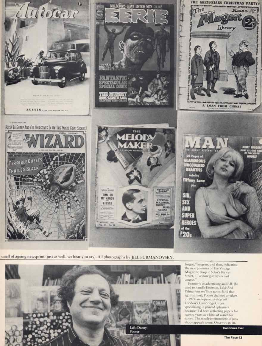


 To see almost 500 magazine covers and pages, look out for my book,


")


")


")

")


