Models wear Katharine Hamnett activist T-shirts on the June 1984 cover of The Face magazine
These days, T-shirts just seem to be covered in commercial logos or platitudes. Back in the 1980s, however, British fashion designer Katharine Hamnett made the activist T-shirt a force to be reckoned with across the world.
Hamnett meets Thatcher
‘Stop Acid Rain’, ‘Worldwide Nuclear Ban Now’ and ‘Stop Killing Whales’ in huge black capital letters on white cotton were among her in-your-face slogans for 1984.
Hamnett even brought her campaigning style to a Downing Street reception to promote Britain’s fashion business in March that year.
She wore one of her own T-shirts that yelled ‘58% don’t want Pershing’ to meet Margaret Thatcher. This was a reference to a US missile system being deployed in Europe. The prime minister is supposed to have remarked ‘We don’t have Pershings, we have cruise [missiles]’ as she shook hands with the designer.
Frankie Goes to Hollywood used Hamnett-style T-shirts to promote Two Tribes, the Liverpool band’s second single after Relax, in summer 1984. The slogans were ‘Frankie Say War! Hide Yourself’ and ‘Frankie Say Relax Don’t Do It!’ Both singles got to number one, as did The Power of Love at the end of the year. Three consecutive chart-topping singles was a feat that not even the Beatles achieved.
Note the word ‘bodylicious’ on the Face cover at the top of the page. It was used 20 years later as the title of a top 10 Destiny’s Child single.
The Observer Magazine colour supplement did its own version of one of Hamnett’s designs for its New Year 1986 cover. Hamnett still does activist T-shirts today.
Get a fix on 86: the Observer Magazine‘s take on Hamnett’s designs for its end of 1985 cover
The cover of Art Buchwald’s 1968 book is on the wall of the editor’s office in The Post
I rabbit on so much about Alfred Leete’s Kitchener poster that I wrote a book about it, but it still never ceases to amaze me the way that Leete’s Kitchener image – and the many derivatives of it – keep popping up. One example is in the Steven Spielberg film, The Post.
A poster for Have I Ever Lied to You?, a book by the Washington Post columnist Art Buchwald, is on the wall of the editor’s office. It can be seen in several scenes. Buchwald is portrayed as Uncle Sam from the 1917 recruiting poster by James Montgomery Flagg.
The Flagg image, which, like Leete’s, first appeared on a magazine cover (Leslie’s Weekly), was a blatant copy of Leete’s September 1914 cover for London Opinion magazine. Flagg simply replaced Kitchener with himself as Uncle Sam, and the poster has been as big a hit in the US as Leete’s was in Britain.
In The Post, Tom Hanks plays the editor, Ben Bradlee. It comes across just like the 1980s TV series Lou Grant. In that, Mrs Pynchon, the widowed owner of the fictional Los Angeles Tribune, was based on two women: Katherine Graham, the widowed owner of the Washington Post; and ‘Dolly’ Schiff, owner and publisher of the New York Post.
Madonna strip cartoon of her life: The Story So Far
Hotspot-5 has 156 Madonna issues up on ebay at prices ranging from £4.95 to £24.95.
One of the earliest issues dates back to January 1986. It’s issue 2 of Look-In, the weekly TV magazine for teenagers, which carried a cartoon strip of Madonna’s life called ‘The Story So Far’.
To see almost 500 magazine covers and pages, look out for my book, A History of British Magazine Design, from the Victoria & Albert Museum, the world’s leading museum of art and design
Today’s relaunched Guardian comes in 3 sections. Sport returns to the back page – led by Liverpool’s thrilling victory over Manchester City. The 2012 redesign had Man City beating Wigan above its masthead. The paper was the Manchester Guardian until 1959 and moved to London in 1964
The Guardian downsizes today, switching from the Berliner format to tabloid. It’s the end of an experiment that began 12 years ago with a massive £80m investment, and has been forced on the paper to save money. Being the only British paper to use the Berliner format, it had to build new print halls in London and Manchester with specially commissioned presses.
The weekday paper now has three sections:
main section: news, politics, international affairs and financial news with sport starting on the back page;
a new, pullout opinion section called the Journal. This will carry the columnists, long reads, obituaries, letters and the cryptic crossword;
G2, the features-based section.
Promotional video for the new look by the Guardian
The Guardian claims a great design history, based on its breaking new ground in 1988 with an approach developed by David Hillman, a Pentagram founder who made his name on Nova in the 1960s. It had already dropped the ‘hang and drop’ approach favoured by the other Fleet Street broadsheets in favour of modular layouts. The other broadsheets’ focus was on getting as many stories and words on a page as possible. The Guardian wanted to differentiate itself for readers.
The 1960s newspaper design guru Allen Hutt gave way to Harry Evans and then Hillman introduced a grid system with lots of white space around the headlines at the Guardian. Alongside the white space, most striking element on the front page was the dual font title, with the ‘The’ in ITC Garamond Italic and the butted-up ‘Guardian’ in Helvetica Black. Nothing new for a magazine, but a first for a British newspaper.
The design industry liked it; the reaction in much of Fleet Street was: ‘art holes’! There was also a lot of negative reaction internally at the Guardian as fewer stories were carried and copy length was cut.
These internal complaints from editors were exacerbated when the paper’s second section dropped from a broadsheet to a tabloid in 1992 – at a stroke, story lengths had to be cut by a third. That is not an obvious effect, but is the result of a number of factors: headline sizes stayed the same; pictures stayed the same size or even got bigger; each tabloid page needed as much margin space around the edges as each broadsheet page; more ‘signposting’ to features in the rest of the paper.
It has been a similar tale with every redesign since for all the papers since: more white space; bigger pictures; fewer stories, fewer words.
September 2005 saw the move under editor Alan Rusbridger and designer Mark Porter to the Berliner mid-size format – along with the need to buy a new set of expensive printing presses that were unique in Britain. The switch took three years and the paper described itself as a ‘factory’. In January 2012 the paper design and format was changed again ‘to reflect changes in news consumption’.
Today marks the Guardian giving up on its expensive Berliner experiment and following the Independent and Times down the tabloid route they took in 2003. Of course, the quality papers don’t like the ‘tabloid’ label, because it is associated with the more downmarket Sun, Mirror, Mail and Express, which adopted the format decades ago.
The other change alongside design is that the print agenda is now dictated by online data and readerships. What the likes of the Guardian don’t appear to appreciate as they quote digital readerships is that the online audience is heavily influenced by non-paying US readers. The news agenda becomes more US-influenced, moving the paper away from the home audience all the time.
Robert Harling, the long-serving editor of House & Garden and typographical adviser to the Sunday Times railed against the Continental modular magazine design approaches in the Times Literary Supplement with an article entitled ‘Poor old words’ (1972). His redesign of the cover for Wisden’s Cricketers’ Almanack in 1938, with its Ravilious engraving of Victorian cricketers, is a typographic classic. For Harling, the likes of Hillman’s Nova was dominated by ‘pictures and type-patterns subduing the words on every page’. The approach was ‘a menace to the freedom of the printed word’.
A features spread in the Berliner format Observer. It could have come from a magazine 30 years ago. The picture is the size of a tabloid page and the text only occupies a quarter of the page area
Yet that approach became mainstream in magazines and Hillman brought it to the Guardian in a process of magazinisation. Photo-reduce many newspaper spreads today and they appear strikingly similar to the sort of designs in the 1960s in Town and Nova (which had been heavily influenced by Continental design, particularly Germany’s Twen). ‘Poor old words’ said Harling. Poor old readers too.
The Guardian‘s sister paper, the Observer, will go tabloid on Sunday. The switch was seen as step too far for the two papers in 2005, with staff fearing that changing to tabloid would damage the paper’s character. Those fears have been swept aside now as the need to save several million pounds a year bites.
The redesign features a new font, Guardian Headline by Commercial Type, the foundry that created Guardian Egyptian for the Berliner redesign. The main text font stays the same, no surprise given how much the 2005 relaunch cost.
And cutting costs is what has driven the changes. Expect to see lots of mentions of ‘150 million’ readers each month, but at the end of the day, most of these are browsers and bear no comparison in revenue or commitment to the value of a print reader. Money – getting enough of it is the big problem for the press.
To see almost 500 magazine covers and pages, look out for my book, A History of British Magazine Design, from the Victoria & Albert Museum, the world’s leading museum of art and design
Beano magazine was launched in 1934 by Nalgo, the trade union, to raise funds for members widows and orphans. Did it inspire the comic title?
Here’s a cheery cover for a rainy day (and I’m off to a funeral today for Tom Pride, a Times journalist I first worked with in 1980).
Beano comes from B ‘n’ O, the abbreviation for Nalgo’s benevolent and orphan fund (B&O). Nalgo – the National Association of Local Government Officers trade union – was founded in 1905 and is today part of Unison. It appears to have been produced in Scarborough, described as the ‘conference town’ because of the number of big meetings held there, such as political party annual conferences.
Winter’s Pie, an edition of Printers’ Pie, magazine cover from 1913. The cover is by John Hassall
Producing special magazines to raise funds for charitable purposes was a popular strategy right into the Eighties. These included Printers’ Pie, where the funds went to printing charities, Christmas Pie, ‘All profits to King George’s Jubilee Trust’ in 1939, and Blighty, which raised money for the troops in both world wars. The most famous writers and illustrators would provide work for these and volunteer printers would produce them on Fleet Street presses.
The Nalgo Beano cover appeared in 1934, four years before DC Thomson launched the famous Beano comic on 30 July 1938 in Dundee. And, of course, its most famous strip – The Bash Street Kids – was about the perils of a group of public service workers – teachers and janitors – in a state school.
The Oxford Dictionary relates the word ‘beano’ – a rowdy celebration – to the printing industry, going back to 1888:
CT Jacobi,Printers’ Vocab. 7Beano, a slang abbreviation for ‘beanfeast’, which is, however, usually termed ‘goose’ or wayzgoose by compositors.
So, a trade union – Nalgo – was the inspiration for the Beano comic. That’s my theory and I’m sticking to it!
To see almost 500 magazine covers and pages, look out for my book, A History of British Magazine Design, from the Victoria & Albert Museum, the world’s leading museum of art and design
The royal twee: Prince Charles as urban ethnic nomad by Joe Casely-Hayford. In the bottom right the heir to the throne is out to lunch in Franco Moschino
September 1988 saw the arrival of a new magazine, IPC’s interpretation of a French title that dated back to the 1930s, Marie Claire (I know Wikipedia says it came to the UK 1941, but that just shows how unreliable it is!) It was a breath of fresh air under the editorship of Glenda Bailey. She was seen as an unlikely choice, but talked her way into the job and made a great fist of it, bringing in investigative pieces alongside the fashion. Bailey has since joined the long list of British editors to cross the Atlantic, heading up Harper’s Bazaar since 2001.
Hallo tailor: Prince Andrew as ship’s matey in Byblos. Right, Charles at home in Moschino
It’s worth getting out these old copies of Marie Claire for articles such as ‘Royal makeover: The princes’ new clothes’. It wasn’t an original idea, Nova ran a piece in 1968 that had French fashion designer André Courrèges giving the Queen a makeover (it caused a storm at the time!). Marie Claire went a step further in tackling Princes Charles, Andrew and Edward – and … well just look at the cross-dressing pictures!
Boys will be boys. Prince Andrew in English Eccentrics. Left, Edward in Rifat Ozbek and John Flett
Here’s what Marie Claire said at the time:
If the Royal family has become nothing more than a collection of clothes-horses, we know who to blame, don’t we? The Princess of Wales (5ft 10in, pencil slim) transformed herself from little-girl-lost into Miss United Kingdom as if she’d been anticipating the event since birth. The Duchess of York (5ft 8in, rolling gait) exacerbated the situation by contrast: she caught the public imagination as the All England land girl. Even the Princess Royal (5ft 7in, very ordinary) has suddenly acquired an incongruous interest in fashion.
The Princes, however, have been cruelly denied the opportunity to follow in the wake of their womenfolk. Protocol decrees that these unfortunate patricians should appear publicly in sub-Next and privately in the limited shades of country compost. Sympathetic to their predicament, Marie Claire asked designers Joe Casely-Hayford, Franco Moschino, Rifat Ozbek, John Flett, English Eccentrics and Byblos to give Princes Charles, Andrew and Edward the same equality of opportunity as their female counterparts.
Knowing that this would be a difficult creative task, we did not ask them to design for the actual Royal physique, nor did we specify whether the ensembles were for state occasions or intimate At Homes, but our philanthropy may result in a new age of elegance for the Royal male. Windsor change?
To see almost 500 magazine covers and pages, look out for my book, A History of British Magazine Design, from the Victoria & Albert Museum, the world’s leading museum of art and design
David Deutsch and David Johnson-Davies wrote the Spider curve-plotter for the October 1986 Acorn User (Computing History Museum)
A discussion of quantum computing is not what many people expect from a blog about magazines, but then they forget that magazines have a habit of going anywhere and discussing anything.
Back in 1986, I commissioned an article for Acorn User magazine, which was later dubbed ‘Spider Power’, from David Johnson-Davies and David Deutsch. The blurb on the contents page read: ‘The Davids present their Spider curve-plotting program to plot almost any equation.’
The Spider was an incredible BASIC program that really did do what it said it would. It was my favourite program – even over the breakthrough fractal routines and Mandelbrot listings we ran. You could type in an equation – even a mix of cartesian – x and y – and radial – r and θ – and still it would print the equation. Raise x to the power of θ, y to the power of r, whatever you typed in, the Spider plotter went away and did it.
One example it plotted was a a set of circles arranged at regular intervals. Don’t ask me to remember the equation. But get hold of a copy of Acorn User from October 1986, issue 51, on eBay and you can see it all there. Type the listing into a BBC Micro emulator and you can run it too.
It was worth buying a £400 BBC Micro just to run this program. There was nothing like it on a £3000 Apple Mac. You’d have had to go to a minicomputer. The only problem was the time it would take – days, weeks even. I gave up on several plots. Even with a second processor attached (which probably tripled the processing speed).
David Deutsch – ‘father’ of quantum computing
But what about the quantum computing? Well, the Davids behind the program were the MD of Acornsoft and a researcher at Oxford University. David Deutsch, the latter David, was tricky to get hold of because he never got up till 3pm (typical student I remember thinking!). When you did get hold of him, you learnt of his theoretical world of computing using the states of atoms for computation and data storage. Given the billions of atoms in a grain of sand, the possibilities are incredible (as seen in the 2020 Alex Garland series, Devs, on BBC TV).
Deutsch had recently published his landmark paper on the topic – ‘Quantum theory, the Church-Turing principle and the universal quantum computer’ – and today he’s regarded as the father of quantum computing. The only problem with such machines, I’m sure someone told me at the time, was that they might disappear because they had moved into another dimension (unlikely, but theoretically possible).
All this has been sparked by The Economist‘s quantum computing technology quarterly (QC in TQ). The TQ is entitled ‘Here, there and everywhere’ and I read it on a plane from from Sydney to Hong Kong. The theme of the articles is that the technology is at the stage where it is about to be commercially exploited.
But keep hold of that 1986 Acorn User magazine because it gives an insight into the thinking of one of the greatest minds of this century. When Dr Deutsch wins a Nobel is probably the time to sell it.
Spider power: some curves plotted in 163 lines of BBC Basic
Madonna on the cover of i-D dated March/April 1984
A copy of the March/April issue of i-D from 1984 has sold on eBay for £179.99. It was marketed as ‘MADONNA’s 1st magazine cover’ and the listing went on:
This is the super collectable and rare Madonna issue. It was her VERY FIRST magazine cover. Spotted in a club in Paris, and photographed by Mark Lebon when she arrived in London. There’s no interview as such, a couple of quotes, including these snippets: ‘I moved to New York because my father wouldn’t let me date boys… I was 17 when I saw my first…’
But this ‘first cover’ claim seems dubious when No 1 magazine had her on its cover dated February 4.
Madonna magazine cover – No 1 from 4 February 1984
And Smash Hits followed 12 days later. This magazine also sells well across the world, fetching £28 in the UK and $49 recently in Australia. In addition, a collection of 31 Madonna magazines described as ‘all mint’ and ‘some very rare’ from 1984 to 2017 sold in Oz for $407, attracting 13 bids. The lot included the 1984 i-D., as well as Playboy, Face and Tatler Madonna issues.
Smash Hits, dated 16 February 1984
The March/April issue of i-D may well have been on sale in February, because monthlies usually come out towards the end of the month preceding the cover date, but as early as the 4th, No 1‘s cover date, seems unlikely.
Despite Madonna’s popularity in the music press, the first reference I can find to her in newspapers is in ‘Eurythmics singer brings his studio’, a feature by Todd Webb in the
16 August 1984 Daily Oklahoman, an American paper. The profile of Dave Stewart mentions that:
his travelling notebooks – cassettes containing miles of taped songs, song fragments and melody lines – have yielded three songs for the new Tom Petty album, a new song in the making for Madonna, and plans to ‘experiment in the studio’ with [Lou] Reed
No doubt, Madonna experts will be able to identify the track – and this press cutting is undoubtedly one many fans aspire to as well. Just a few months later, The New York Times of 6 January was talking of how:
No phenomenon illustrates more pointedly how pop music history seems to run in cycles than the overnight success of the 24-year-old pop siren known as Madonna. The month before Christmas, Madonna’s second album, Like a Virgin sold more than two million copies (‘Madonna’s siren song’ by Stephen Holden)
It takes another six months before Britain’s mainstream press picks up on a phenomenon that swept its pop magazines before anywhere else. Surprisingly, it was The Times that leapt in, though with a highbrow angle about women’s liberation:
The United Nations decade for women reached its climax here with Playboy and Penthouse rushing to beat each other to the newsstands with nude pictures of pop star Madonna. For those who do not follow the pop scene closely, I should explain that Madonna is not a successor to the Singing Nun but the very latest sex symbol. Her stage costume consists of lacy underwear, bare navel, micro-skirt and crucifix. (‘Liberated – with frills attached’ by John O’Sullivan, 13 July 1985)
A month after its decade for women article, The Times was quoting Madonna’s press team in a piece about pop and film soundtracks, saying ‘she’s the hottest crossover dream to burn up the charts since Elvis’. From nowhere to Elvis in a year, not bad going – and then she hitched up with actor Sean Penn and the anti-Madonna ‘flirt rock’ reaction kicked in.
To see almost 500 magazine covers and pages, look out for my book, A History of British Magazine Design, from the Victoria & Albert Museum, the world’s leading museum of art and design
Lord Goodman jumps out of a giant birthday cake on Private Eye’s 500th issue cover of 13 February 1981
Private Eye registered a sales figure last week at just over a quarter of a million copies an issue for the second half of 2016. Under editor Ian Hislop, it claims the high ground as the best-selling news and current affairs magazine.
The circulation per copy breaks down as 105,077 through newsagents, 142,833 subscriptions, 2,214 bulk sales and just 22 copies free. It total, that’s three million copies a year from its fortnightly mix of satire and investigative journalism. While the newspapers keep jacking up their prices – arguing readers will pay for quality reporting – but lose sales, the Eye holds its price at £1.80 and buyers and subscribers keep coming.
The cover above is from 13 February 1981, when the Eye was celebrating its 500th issue with a Willy Rushton cartoon. Out of the giant birthday cake festooned with writs jumps Lord Goodman – an early ally of Private Eye. Rupert Murdoch can be seen waiting on then editor Richard Ingrams in the top left and Gnitty, the magazine’s mascot Crusader, is also seated at a table. Around them are foes, friends and characters from the magazine.
A punning advert from Letraset for Private Eye’s celebratory 1981 issue
Although the magazine had survived many legal battles, such as the 1976 onslaught from James ‘Goldenballs’ Goldsmith who issued 60 writs against the Eye and its distributors in one month, many more were to come, including those with Robert Maxwell and his Not Private Eye. In 1990, Private Eye was threatened with closure when Sonia Sutcliffe was awarded £600,000 in libel damages. Hislop said that if this was justice he was ‘a banana’. The sum was reduced to £60,000 on appeal.
Inside the anniversary issue are many supportive advertisers, including Letraset, the makers of dry transfer lettering, a revolutionary British invention in its day, but now a French-owned brand mainly selling marker pens.
Private Eye‘s title was an early success for Letraset – the typographer Matthew Carter did the design, which saw its first outing on 18 May 1962 and is still in use today.
To see almost 500 magazine covers and pages, look out for my book, A History of British Magazine Design, from the Victoria & Albert Museum, the world’s leading museum of art and design
Today out of my archive comes Now!, a magazine launched by the business tycoon Sir James Goldsmith – ‘Goldenballs’ as he was known to Private Eye – as a right-wing news weekly. Ridiculing the Queen is rarely a good idea for newspapers and magazines – even Kelvin McKenzie could not get away with it at the height of his powers as editor of The Sun. And Now! had a powerful enemy on its back – Private Eye.
Private Eye ridicules Goldsmith’s Now! (9 September 1979)
Private Eye and Goldsmith had fought vicious legal battles and from the outset the Eye ridiculed Now! , though never using its proper title, instead dubbing it ‘Talbot!’.
Before the first issue came out on September 14, 1979, the Eye ran a page ridiculing the magazine and its journalists under a reversed-out headline in Now!‘s title type, saying WHO?. A subdeck asked ‘Up what part of whom are these seedy looking hacks gazing in admiration?’ The first paragraph read:
You won’t recognise any of these people(except possibly John Lander, who used to be on News at Ten years ago). Others are better known in the bars and betting shops of Soho. But all of them have one thing in common. They are all anxious about the future. That’s why they’ve all decided to invest in the James Goldsmith Pension Fund of Funds.
Private Eye celebrates the last Now! magazine (5 May 1981)
It goes on to set out the reasons of all the hacks in sycophantic terms. One of the editors has a speech bubble saying: ‘If you know a better hole, look up it!’ (A reference to the Bruce Bairnsfather cartoon character Old Bill, whose most famous cartoon has the grumpy First World War soldier stuck in a water-filled shell hole and saying to a colleague, ‘If you knows of a better ‘ole, go to it!’)
Such was the Eye‘s venom that as well as frequent articles, it even ran a regular strip cartoon, called Focus on Fact – Talbot!, ridiculing Goldsmith and the magazine. When Now! folded with a final issue dated 24 April 1981, Private Eye ran a celebratory cover ‘Talbot memorial issue. A nation mourns’ (5 May).
To see almost 500 magazine covers and pages, look out for my book, A History of British Magazine Design, from the Victoria & Albert Museum, the world’s leading museum of art and design
Town magazine and the`Girl in Red Water up to her Charlies’ cover from September 1965
Madonna on the front cover of Cosmopolitan magazine in the US for May 1990
Girl Illustrated front cover with Dr Who girl Katy Manning and a Dalek
Marilyn Monroe on the cover of Blighty from 1956
Diana Rigg as The Avengers’ Mrs Peel on the cover of TV World in 1965
New Illustrated starts to change its name to Record Weekly in 1920 (January 17 issue)
Chilprufe advert from Queen magazine in 1961
HMS Queen Elizabeth super dreadnought by Harry Hudson Rodmell on the cover of New Illustrated magazine (18 October 1919)
Acorn User magazine cover from December 1982. This issue would have been edited from the Bedford Square offices
The Kitchener poster shown in the third part of the Great War partwork in 1933
The pointing man from an advert in London Opinion magazine, 17 September 1910
The first Daleks cover for Radio Times in November 1964
Tom Browne’s drawing shoe incredible attention to detail; he could do so much with so little
Margaret Banks drew this charmer for Home Chat magazine in 1938. Note the baby is wearing reins
Tatler magazine’s front cover in 1901
Eddie Hapgood, the England and Arsenal captain, on the cover of Weekly Illustrated in 1934 with his son, Tony
Racy illustration by Oldham for the weekly magazine Woman
‘K of K’ – Kitchener of Khartoum – caricature by Will Scott on the cover of Drawing magazine in February 1916
A colour cover for Crusoe magazine of January 1925
The glossy monthly Queen occupied the old Tit-Bits office in 1947
Karl Marx as the Uncle Sam derivative of Kitchener
Hand-drawn title for Drawing magazine, February 1916
Cover of Le Petit Journal of 25 June 1916
Home Chat cover from 19 September 1914 with a front cover story about supporting the Queen’s Guild, which had been set up as a way for women to back the war effort
Kate Moss in Corinne Day photograph on cover of the Face in July 1990
Leader magazine led the world in putting Marilyn Monroe on its cover in April 1946
Detail of Helena Christiansen’s face from the Vogue cover
José Ferrer as Cyrano de Bergerac on this Everybody’s magazine cover from 10 October 1951. The design has a 3D effect, with the nose appearing to stand proud of the page
Madonna cover from i-D dated March/April 1984
New Statesman 1993 jan 29 John Major Clare Latimer
Winnie the Pooh appeared exclusively in colour in six 1928 issues of Home Chat
This 1946 holiday season cover from John Bull forecasts a web fate for the slumbering gent
A Heartfield montage on the cover of Picture Post dated 9 September 1939
Debbie Harry and Blondie on the first issue cover of Smash Hits from November 1978
The return of the Daleks to Dr Who in 2005 sparked this gatefold cover for the Radio Times
Je Suis Charlie – Charlie Hebdo’s website after the murderous attack on its Paris office
A whacky contrast in all senses of the word from the previous week
Opening of 5-page article on the set of 2001: A Space Odyssey with sketches by Clive Arrowsmith in Town magazine
‘Mother Christmas’ cover for Needlewoman magazine from December 1925
Front cover title from Woman’s Own from 19 May 1955
Weekly Illustrated magazine pioneered photojournalism (3 March 1936)
Popular Flying in 1934 when it was edited by Biggles creator WE Johns
Blighty pin-up cover for the popular men’s weekly by MB Tompkins in 1958 (16 August)
Adrian Flowers took this Nova cover (July 1971)
This is the cover for the relaunch of Woman’s Own in 1937 as a colour weekly. Note this is a true self referential cover because the woman is holding a copy of the magazine she appears on!
Kate Greenaway painting called ‘Darby and Joan’ on Illustrated London News – or is this a pair of radical printers?
This cat with its amazing, lip-licking tongue is from a Whiskas advert of 1964
53 Bedford Square in London’s Bloomsbury. This Georgian building is up for sale at £12 million
Ronald Searle’s cartoon glossary to printers’ jargon
Woman’s Fair from January 1940 filled with content from the US, including a Jon Whitcomb cover illustration
One of Miss Fish’s drawings of Eve, from the popular Tatler column
A different look for the cover of Smash Hits, also in February 1984
Woman’s Own liked clean cover designs in the 1930s with few cover lines – but notice Ursula Bloom promoted her for a special article (30 July 1938)
A letterpress flyer for the latest serial in Pictorial Magazine – could this 1902 image have sparked Alfred Leete’s imagination?
Peter Hack-Brookes cover for Oz from September 1971 – a copy from a US magazine cover by Peter Driben from 1949
The first Sunday Times colour section from 4 February 1962 (though the cover is not dated)
Marc Jacobs 2014 Playboy special issue in perspex box
Mussolini writes for the right-wing Britannia magazine in 1927
Evil victim: Diana Rigg on the cover of the Sunday Times Magazine, 28 February 1982
Cover of BOAC’s inflight magazine Welcome Aboard in 1970
The Penny Magazine shows itself being sold from what looks like a railway station stall in 1904
An in-your-face spread from Loaded in May 1995
Cute cover-up: Naomi Campbell on the cover of GQ in April 2000
Strand magazine front cover from March 1891 by George Charles Haité
Look, spring 2009
Marion Jean Lyon in 1923
The Observer Magazine cover shows Alexei Sayle as the Hitler diaries forger in the 1991 TV series Selling Hitler
Raphael Sabatini’s Captain Blood brought to visual life on the cover of Pearson’s Magazine (1930) by Joseph Greenup
This logo from the Daily Mail echoes the original masthead for Answers Magazine
John Bull in 1917 – the magazine was used as a promotional tool for Horatio Bottomley’s financial schemes
Beautiful Britons glamour magazine first issue cover from November 1955
Bovril advert of Hercules fighting a lion by Stanley Berkeley from Young Gentlewoman magazine of 1892
Anna Wintour was told this Madonna cover would not sell
Racy French weekly Vie Parisienne from 1926
Germany’s leader, Kaiser Wilhelm, with his flamboyant moustache and military uniform, at the start of World War I. He is described as ‘The Ravager’
The first issue cover for Carlos, an inflight magazine for Virgin in 2003
Home Chat, a leading women’s popular weekly, from 14 May
FHM June 2004. But what’s happened to the nipples on Abi Titmuss?
Madonna rides again on the cover of Cosmopolitan with its May 2015 issue
Vivian Blaine from the London stage adaption of the musical Guys and Dolls on the cover of Picture Post in 1953
Last issue of Rupert Murdoch’s Today newspaper (17 November 1995)
Lilian Hocknell artwork revived for Christmas 2014 Vintage View from Woman’s Weekly magazine cover
Billy Fury? James Dean?
The first issue cover of John Bull from 1 April 1903
John Gwynn’s poem ‘A Death Mask’ in the Strand magazine appears to have been inspired by a drowned woman in Paris


 To see almost 500 magazine covers and pages, look out for my book,
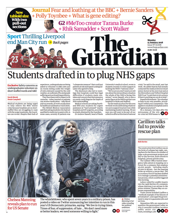


")


")


")


")


