
Strand magazine front cover from March 1891 by George Charles Haité
The Strand is one of the world’s most collected magazines, both in Britain and the US. The reason for its fame to this day lies undoubtedly in the stories of Arthur Conan Doyle featuring the fictional detective Sherlock Holmes. If you want to buy a set of the 75 issues that carried the Sherlock Holmes stories, you can expect to pay £55,000!
The magazine started with a cover date of January 1891, but, as happens today, was available a week or two before that date. It was a goldmine for its publisher, George Newnes, selling about 300,000 copies a month for the next 40 years in Britain and another 100,000 in the US until 1916. From the start, it was published in America with much the same content, but a month later, with its own editor, James Walter Smith. It was a trendsetting title, with an illustration on every page, a dedicated puzzles page and publishing not only Conan Doyle but also E.W. Hornung, H.G. Wells, E. Nesbit, Rudyard Kipling, O. Henry, and P. G. Wodehouse. The cover stated ‘edited by Geo. Newnes’ until 1914, but the power behind the editorial throne was Herbert Greenhough Smith, the literary editor, who worked on the magazine from 1891 to 1930. The magazine’s offices were in Burleigh Street off The Strand in London.
In an article to mark the 100th issue (April 1899), ‘A chat about its history‘ by Newnes, he says that it was originally to be called the Burleigh Street Magazine, but this was too long, so the Strand Magazine was chosen.
Its first cover design by George Charles Haité – like that of Richard Doyle’s for Punch – was long-lasting and is an icon of illustration. One of its early Haité covers (displayed on an iPad) was used for the jacket of Revolutions from Grub Street, a history of magazine publishing from Oxford University Press by Howard Cox and Simon Mowatt. But that iconic Strand cover is not as constant as you might think, as we’ll see. This post explores why the Strand cover looked the way it did and how it tried to change with the times.
George Haité – the Strand cover artist
George Charles Haité (1855-1924) was a decorative artist, designer, painter, illustrator and writer and lecturer on art.
His father, George Haité (1825-1871), was a fabric designer, many of whose works are in the V&A Museum, alongside hundreds by his son, who often signed himself GC Haité. Hundreds of GC’s designs were donated by his daughter, and are stamped with his address: Ormaby Lodge, The Avenue, Bedford Park, in West London.
GC was the first president of the London Sketch Club in 1898, set up at premises in Chelsea for graphic artists and featuring leading black-and-white artists artists such as Tom Browne, Phil May, Alfred Leete, Edmund Dulac, John Hassall, Heath Robinson and HM Bateman. The National Portrait Gallery holds two portraits of GC, showing the walrus moustache that dominated his face.
Haiti’s view down The Strand
Haité’s iconic illustration shows the view looking east along The Strand towards the church of St Mary-le-Strand. Then, as now, The Strand runs from Charing Cross to Temple Bar – two London landmarks that have also given their names to magazines. Temple Bar was a gate placed where The Strand ends and Fleet St begins, at the boundary between Westminster and the City of London. The Wren-designed gateway became a bottleneck for traffic and so was removed in 1878. It now stands in Paternoster Square, by St Paul’s Cathedral.
The Strand was regarded as a fashionable thoroughfare, linking the City of London and St Paul’s with Buckingham Palace, the Houses of Parliament and Whitehall – the financial, religious and political establishments at the heart of the British Empire. At its east end, it became the media hub of Fleet Street – the fourth estate – and at its west end was Trafalgar Square.
 Strand Magazine front cover of March 1891 |
 The Strand and Burleigh Street – the view as it is today with ornate street lamps lit. Just past the traffic lights on the right is Lancaster Place, leading south to Waterloo bridge |
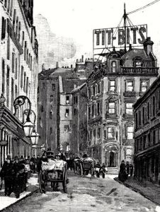
Haité’s view is pretty accurate, as the photograph above shows. The image was drawn from the bottom of Burleigh Street, where the offices of Tit-Bits and Strand publisher George Newnes were located. There are several details worth noting:
 |
 |
 |
| Price of an issue |
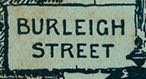
Street sign |
 |
 |
| The title lettering is hung from telegraph wires across the street |
The number 359, The Strand address of the property on the corner |
Board points towards 12 Burleigh St. There would have been no such hoarding |

Also note the two newspaper sellers, one dashing across the road, the nearer one on the pavement selling copies of Tit-Bits – you can make out the title on the copy under his arm. This, of course, is a reference to the weekly magazine that established Newnes’ name in 1881, was the first example of the mass media and became the progenitor of today’s tabloid press.
Most of the pedestrians are men and the back of the stout gentleman on the left looks as if it could have been a true portrayal, but who could it be? George Newnes, the magazine’s founder? The artist himself looks too scrawny in the many sketches of him by fellow artists (though one of the NPG portraits shows that Haité’s figure filled out later!).
Within the first issue
 The first issue of the Strand carried a 10-page article about the famous thoroughfare and its surrounds with several sketches by Haité. One showed the view north from The Strand to 12 Burleigh St, where both the Strand and Tit-Bits were published. Crossing over the Strand from Burleigh St takes you straight into the Savoy hotel. Again, the sketch can be compared with the view today – and a 1940s illustration of the same building from when it was occupied by Queen magazine, a title that dates back to 1861. Compare the street lamps in Haité’s Burleigh St sketch below with the lit lamps in the modern-day Strand photograph – they look very similar.
 Haite’s sketch of Burleigh St from the Strand showing the Tit-Bits office with its huge rooftop sign on the right |
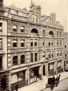
 The former Tit-Bits and Strand office at 12 Burleigh St, without the rooftop sign. Exeter St runs to the right |
 Queen occupied the old Tit-Bits office in 1947. Another former occupant was Health & Strength in 1910 |
The article notes that the street took its name from Lord Burleigh, a leading statesmen in the time of Elizabeth I, who lived on the site of the Tit-Bits office at the corner of Burleigh St and Exeter St (today best known for the American-style restaurant, Joe Allen’s). Exeter St takes its name from Burleigh’s son, the Earl of Exeter.
It goes on to explain that many street names on the south side of The Strand came from the nobles on whose former riverside palaces the area was developed, including George Villiers, the Duke of Buckingham. He lived at York House, where today you find the Adelphi and the Adam brothers architecture around the Royal Society of Arts. The Palace of the Savoy has engraved itself in the area as the name of the world famous hotel (where taxis drive in on the right-hand side of the road as a welcome to American guests). People associated with The Strand and its surrounds include Dr Johnson and Sir Walter Scott, who both banked at nearby Coutts; the painter William Etty, Samuel Pepys and Peter the Great have all resided in Buckingham St; Evelyn and Tatler founder Steele both lived in Villiers St (though ‘it is now the haunt of anything rather than genius’). Northumberland House, the last of the palaces, had only been demolished in 1874.
In the same way that Tit-Bits was the most popular weekly, the Strand soon became the best-selling monthly, built on the massive popularity of the ‘consulting detective’, Sherlock Holmes. However, as we shall see, Haité’s cover faced challenges in adopting to the times.
The Strand magazine: Haité’s cover evolves
The Strand followed an established publishing strategy in that it was designed to be bound into volumes twice a year. Each issue consisted of an outer wrapper to protect the contents, which consisted of a run of advertising followed by the editorial content and then more advertising. Twice a year, the six issues would be collated by stripping away the wrapper and advertising and binding the editorial into volumes along with titles pages, a frontispiece and index pages that came with the final issue for each volume. That is why the editorial pages are numbered to follow on from each other between issues, reverting back to 1 for the start of each new volume. The publisher would also offer complete bound volumes in various finishes, from cloth to leather, depending on the buyer’s purse. So Haité’s covers would have been thrown away, though the standard Newnes binding showed the illustration on the front of the volume.
The magazine became an institution, and Smith will have been reluctant to tamper with such a successful formula. Readers – particularly regular buyers – are creatures of habit. (As editor of Acorn User, a computer magazine, in the 1980s, I remember receiving letters of complaints when the lettering on the spine was accidentally printed black, rather than the usual red because it ‘ruined’ the look of the magazines on a shelf! And Fleet Street legend has it that woe betide any editor who moves the crossword in a daily paper.)
However, various factors forced changes on the cover design.
Newnes offices in Southampton St. The man on the left is looking into the Tit-Bits window
First, Newnes expanded, launching more magazines and so had to move out of the Burleigh St office. The company didn’t go far – just two streets west along the Strand into 7-12 Southampton Street. (By 1925, Newnes expanded again into Tower House next door, where the company stayed until it merged into IPC in the 1960s and moved across the river into King’s Reach.)
So the street name was altered on the Strand cover to match the new address and the number 359 taken off the building wall. In addition, the company’s new name and address was printed along the bottom of the cover. This addition was the start of a slippery slope.
Soon, a cover line was added across the top, promoting another Newnes magazine or the contents of an issue, such as:
- ‘Now Ready, THE PICTURE MAGAZINE. Companion to THE STRAND MAGAZINE’ (Aug 1893).
- ‘Xmas Double No. 294 ILLUSTRATIONS. 208 PAGES. 1/-‘ (Dec 1895);
- Rodney Stone: CONAN DOYLE’S magnificent New Story, Commences in this Number’ (Jan 1896).
- ‘Pictures on the Human Skin. See Page 428. EASTER EGGS. See Page 373. FLOODS. See Page 441’ (April 1897).
On the Christmas 1896 cover, a cover line was set below the title: ‘The most profusely illustrated magazine in the world’. Christmas issues were dated December and, at one shilling, were double the usual price. Christmas 1897 saw another innovation: advertising appeared on the cover. On the brickwork above the street sign, a small hoarding appeared: ‘Hall’s Wine. See Page XI’ (the advertising pages carried Roman numerals, distinguishing them from editorial). Another innovation for this issue was that the price and issue details – 208 pages, 323 illustrations – were made more prominent by being carried in a box below the title.
The hoardings carried on, sometimes referring to an advertising page within the issue or sometimes as a standalone. Fry’s Cocoa took this position throughout 1899 until 1925, when it was replaced by Oxo.
In addition to the extra content and illustrations, the cover for the December 1903 Christmas issue was in lavish colour.
George Newnes himself died in 1910, but the company carried on under his name. The Strand cover hoarding of ‘Edited by Geo. Newnes’ continued until 1913 when it was replaced by the issue date and used for information such as subscription prices.
Technology catches up with Haité’s cover in 1914, when motor cars replace the horse-drawn hackney carriages of the Victorian era.
This was also a great time of experimentation in terms of cover promotion. The boxes come in various shapes and sizes and a second colour, spot red, is used to pick out the highlights.
Sherlock Holmes on the Strand’s cover

Strand magazine of September 1914 puts Holmes on the cover
Even as the boxes had got bigger and the covers become more littered with marketing material, Haité’s illustration was still the dominant image. That changes with the September 1914 issue – which will have appeared in newsagents just after the war broke out – when Sherlock Holmes (who else!) breaks the mould. Not only does the cover line at the top expound the start of a new Conan Doyle serial, ‘The Valley of Fear’, but the detective himself is portrayed musing over a coded letter while he smokes a pipe. Much of the traditional illustration is obliterated by the coloured oval image.
Although Smith published many famous writers and stories in the Strand, Sherlock Holmes held the most pulling power and the editor clearly felt the need to promote the character as much as possible. The relationship between Holmes and the Strand begins with ‘A Scandal in Bohemia’ in July 1891, the sixth issue of the magazine. The story was illustrated by the artist Sidney Paget whose images have set the tone for the look of Holmes ever since; he even introduced the deerstalker hat to the character. However, Conan Doyle killed off Holmes in a fight with his nemesis, the criminal mastermind Moriarty, in ‘The Final Problem’ after two years in the magazine. The character did not return until the spectacular ‘Hound of the Baskervilles’ in 1901. At Conan Doyle’s insistence, Paget also returned as the illustrator. After that, stories appeared regularly until 1927. In all, there were four novels and 56 short stories over 75 issues.
The Strand in the Great War and 1920s
For the rest of the war, the strategy of ever more prominent boxes continues. The lower hoarding is used to encourage readers to make use of a scheme to support the troops: ‘You can end this magazine Post Free to the troops’; and ‘The best magazine to send to out soldiers and sailors. It goes post free’. The magazine is not free however, and the price rises, first to 7d and then 8d by October 1917. Also at this time, a more striking version of the cover appears with a deep blue sky.

The Strand magazine of May 1922 with a Covent Garden flower seller
In 1922, a more colourful illustration is introduced with a prominent flower seller, presumably from the Covent Garden flower market at the top of Southampton Street.
The title design has been altered and the telegraph wires made less prominent. The price of a copy is now one shilling, and sixpence more for Christmas specials, and Smith has added the Jeeves stories of P.G. Wodehouse to the Strand‘s long list of popular features.
For the next six years, the flower seller is the standard cover, with strong promotional boxes. For the heavyweight series, such as Holmes and the Bulldog Drummond stories of ‘Sapper’ (H.C. Mcneill), one-off covers are commissioned, with the flower seller cover shown in an inset box.

October 1930 Strand magazine has a modern woman on the cover
In 1929, the traditional-looking flower seller is dropped, like the horse-drawn carriages before her, for a more up-to-date image – a thoroughly modern woman. Women dominate the crowds and modern buses dominate the streets. The title design has been simplified again, and the telegraph wires removed. The advertising on the side of the nearest of the buses promotes the Humorist, at the time a weekly humorous magazine in the Newnes stable. Oxo has replaced Fry’s on the advertising hoarding at the top of the 1930 cover shown here.
The boxes at the top and below promote an article by the prominent Conservative politician Lord Birkenhead, and the start of a new novel by P.G. Wodehouse over seven parts. By this time, the US edition has closed and so serialisation of ‘Big Money’ starts at about the same time in the weekly US title Colliers.
The last years of the Strand

This Strand cover design from February 1942 is based on a reworking of the Haité illustration
In 1930, two events occurred after which the Strand could never be the same again: on 7 July Conan Doyle died of a heart attack at the age of 71; and at the age of 75, Smith stepped down from the editorship after the December issue. Conan Doyle’s Sherlock Holmes stories underpinned the success of the Strand magazine, but Smith had encouraged him to write more broadly and he developed other characters, including Professor Challenger. Conan Doyle was also prolific with his non-fiction, with articles on spiritualism, fairies and sport, and he wrote extensively about World War I. In total, Smith published almost 300 contributions by Doyle in the Strand, including 120 stories, nine serialised novels, and dozens of poems and interviews. For 36 years, Conan Doyle wrote exclusively for the Strand, forming a partnership with Smith that is unrivalled in the history of magazines.
Yet the age of Sherlock Holmes was now over, and the magazine’s most famous writer was dead. Deprived of Smith’s sure touch, the Strand went into decline, with four editors in the next 20 years:
Jan 1931 to Sep 41: Reeves Shaw
Oct 1941 to May-1942: R.J. Minney
Jun 1942 to Sep 1946: Reginald Pound
Oct 1946 to Mar 1950: MacDonald Hastings.
Wartime paper rationing forced the magazine to adopt a smaller page size in October 1941. Various artists were commissioned to create covers and frontispieces, including Edward Ardizzone, Robin Jacques and Julian Trevelyan. The covers often made reference to the Haité cover design.
The last issue, March 1950
Despite the quality of the illustrators used, changes to the Strand‘s traditional format and cover seemed to lose its old character and it failed to develop a new one. Sales were down to about 100,000 copies a month and the company published 54 other magazines: with a weekly circulation of 1.5 million copies, Woman’s Own was now the biggest moneymaker on the news-stands. The Strand ceased publication in March 1950, the title being folded into another Newnes monthly, Men Only.
MacDonald Hastings, a former war correspondent who went on to become a TV reporter and roving correspondent for the Eagle comic, was its last editor. The US news weekly Time reported Hastings bemoaning the changing times that had brought the magazine down:
Where are the Conan Doyles today, and where are the readers who want them anyway? What people want today is imaginative reporting; the day of fiction has gone.
Such was the hold that the Strand had on the nation’s psyche that its demise was attacked by the Economist in an editorial:
A publishing house is a business enterprise whose projects must be financially sound, but it is also a trustee of the affections of the reading public, in Britain and overseas, and of that public’s standards of taste. It is sad that George Newnes Ltd should have decided that of the three pocket monthly magazines which they publish, they should dispense with the Strand and concentrate on the publication of London Opinion and Men Only.
The Sherlock Holmes Society was founded the following year.
But the writing was on the wall for such general interest men’s magazines as commercial television took away readers and advertising. London Opinion swallowed the Humorist and then Men Only swallowed London Opinion. The only rival left was Lilliput. That closed in 1960 and Men Only turned into a top-shelf magazine.
 First issue of the New Strand in December 1961, showing St Mary-le-Strand First issue of the New Strand in December 1961, showing St Mary-le-Strand |
 First issue of a US version of the Strand in 1999. The cover illustrations are based on misty views around the area |
A fiction magazine was launched with the title New Strand in 1961 and then another revival, this time in the US, as a quarterly Strand in 1999. But, in the new world of television and the web, neither could hold a candle to the original.
See A History of British Magazine Design from the V&A
See The Victorianist blog for a nice piece on Newnes and the Strand


 The 1924 FA cup final marked just the second such event at Wembley. This was the year after Wembley opened with the famous


")


")


")


")

