In Cover Girl Killer, pin-up models from Wow! magazine are bumped off
A recent post about the Cover Girl movie featured a musical from 1944. But there have been several films about cover girls.
The first was Cover Girl Killer from 1959. The plot was neatly summed up by a publicity poster: ‘First you’re a COVER GIRL … then you’re a CORPSE!’
In this British film, a pin-up model from the fictional Wow! magazine is found dead and is soon followed by others. The police twig that in each case the bikini-clad corpse is arranged in a similar position to her pose for the magazine. There’s a clever serial killer on the loose!
Harry H. Corbett has a starring role as ‘The Man’ with a very strange hair cut and bottle-bottom glasses. This was three years before playing Harold in the long-running TV series Steptoe and Son. Felicity Young plays June, the next model in peril.
Not a good look for Harry H CorbettWow was an American pin-up magazine in the 1950s
Although Wow! magazine did not exist in Britain, there was a US title around the time called Wow, which featured bikini-clad women on its covers, though they were illustrations. Since then, several publishers have used the title. They include WOW, an IPC comic from 1982 and, in 1999, WOW – World of Wrestling – launched. In 2019 there was The WOW, a women’s lifestyle and fashion magazine that featured Asian women. Finally, 100% WOW is a comic for teenage girls.
As for other cover girls on the big screen, Cheryl Hansson: Cover Girl came out in 1981 and That Cover Girl is a Malaysian TV series broadcast since 2023.
Rita Hayworth gets a big chance with the fictional Vanity magazine in the film Cover Girl
Cover Girl was a 1944 Hollywood musical starring Rita Hayworth and Gene Kelly. Hayworth’s character is a chorus girl working with Kelly who is tempted by a chance at stardom as the cover girl of a prominent magazine. She hopes to become the Golden Wedding Girl for Vanity, a fictional magazine published by a fictional Coudair Publishing.
The movie was a big hit – and undoubtedly a marketing boost for the magazines involved.
One of the dance numbers features cover girls representing 15 actual US magazines. They were listed in the film’s credits. Screen grabs of the 15 are shown below. There are plenty of references to the forces – a sign of the WWII times.
American – Jean Colleran American Home – Francine Counihan Collier’s – Helen Mueller Coronet – Cecilia Meagher Cosmopolitan – Betty Jane HessFarm Journal – Dusty Anderson (a World War II pin-up model in a 1944 issue of Yank, a magazine produced by the US army)Glamour – Eileen McCloryHarper’s Bazaar – Cornelia B von HessertLiberty – Karen X GaylordLook – Cheryl ArchibaldMademoiselle – Peggy LloydMcCall’s – Betty Jane GrahamRedbook – Martha OutlawVogue – Susann ShawWoman’s Home Companion – Rose May Robson
Looking at copies of the Boy’s Own Paper recently, I noticed a couple of odd details in the masthead. Look closely at the book in the middle – there’s an expanded image below – and you can make out the word ‘ALBUM’. Perhaps not strange in itself, except for the fact that it’s on the back cover of the book.
Second, the handle of the cricket bat falls behind the letters in ‘boy’s’, yet the rabbit’s ears are in front of ‘own’. The result is to make the middle word look farther away. This effect is exacerbated by the ‘s’ in ‘boy’s’ being slightly too big.
This is the first version of the Boy’s Own title. It is credited to Edward Whymper (1840-1911), though there is no signature. Whymper was an accomplished engraver who had achieved fame not for his skill with a block of wood but as the first man to climb the Matterhorn, the tallest peak in the Swiss Alps, in 1865.
The first issue of the BOP appeared in 1879, so Whymper will have been 39 and an experienced craftsman. Of course, the sketch of the image and the wood carving will have been done back-to-front for letterpress printing, but it’s difficult to imagine him making a basic error, yet strange that he should have added such an incongruous detail on the book.
Even so, the publishers must have been happy with the design because it was used for the next 25 years.
Edward Whymper added the word ‘ALBUM’ on the back of the book
Alan Tracy reading Riviera in the 1966 film Thunderbirds Are Go
Thunderbirds Are Go featuring Gerry and Sylvia Anderson’s puppets on strings was one of the hit movies of 1966. The film was a spin-off from the British TV series Thunderbirds and featured the exploits of International Rescue, a secret organisation with incredible aircraft and rocket ships hidden on a remote island.
The organisation was run by Jeff Tracy, a former astronaut, and the craft were flown by his five sons: Scott, who flew the scout ship Thunderbird 1; Virgil (Thunderbird 2 transporter); Alan (Thunderbird 3 space rocket); Gordon (Thunderbird 4, an underwater craft); John (Thunderbird 5, an orbiting satellite).
In one scene, the youngest of the Tracy boys, Alan, is lounging by the pool at the Thunderbirds’ island base reading a copy of Riviera. This was a fictional magazine mocked up for the film; a similar idea was used by Stanley Kubrick two years before for Dr Strangelove. The Riviera cover showed a woman in what looks like a knitted swimsuit and just one cover line: ‘girls, girls, GIRLS’. The back cover is an advert for ‘Tans’ sun tan oil.
The film sparked coverage in women’s magazines, music magazines and Sunday supplements.
Opening page of Woman’s Own feature about Sylvia AndersonOpposite page of ‘The shy tycoon who loves dolls’ feature
The IPC weekly Woman’s Own ran an article ‘The shy tycoon who loves dolls’ by Max Caulfield. This focused on Sylvia Anderson. It opened with a colour spread showing Sylvia with two of the ‘dolls’ that had made her a tycoon: the ‘glamorous Lady Penelope and chauffeur Parker’ in their pink Rolls Royce.
Other pictures show the Tracy family at a restaurant with beards and moustaches as disguises. On the best table are Lady Penelope and Alan right in front of the band – puppet versions of Cliff Richard and The Shadows.
The band released a 45 rpm extended play (EP) disc with four tracks from the film: ‘Shooting Star’, ‘Lady Penelope’, the ‘Thunderbirds Theme’ and the ‘Zero X Theme’. Zero X was a Mars spaceship that has to be rescued by the Tracey boys.
The puppetised Cliff and The Shadows was front-page news for Record Mail
The EP was front-page news for the monthly Record Mail published to promote EMI records. The cover picture caption read:
It can’t be – it must be – it is! Cliff and The Shadows have been puppetised for a new film – Thunderbirds Are Go! They have recorded an EP of four numbers from the film on Columbia SEG8510.
Cliff Richard and The Shadows soundtrack
The copy on the back of the EP ran:
After the tremendous success of the Thunderbirds television series. Gerry and Sylvia Anderson decided to produce a full-length version for the cinema. One of the many new ideas that was incorporated was to use puppet replicas of Cliff Richard and The Shadows. The experiment proved to be a great success. Infinite care was taken to ensure that the puppet characters were as true to life as was possible. Firstly, Cliff and The Shadows were photographed from all angles and then the Century 21 sculpting team went to work. Many heads were rejected before a satisfactory result was obtained. Thunderbirds are Go is a thrill-packed adventure story, but the introduction of the Swinging Star night club sequence, in which Cliff and The Shadows feature, provides the romantic interlude necessary to give the film good balance.
Boy’s Own Paper from 1885 showing a printer’s composing room
The serial Reginald Cruden: A Tale of City Life shown on this frontispiece is about the adventures of two brothers who are taken out of school to work when their parents are imprisoned. It’s typical of the stories written for the Boy’s Own Paper by Talbot Baines Reed (1852-93). Reed created a genre of school stories that was widely copied well into the next century.
The idea for ‘BOP‘ came from George Andrew Hutchison (1842-1913) and he persuaded the Religious Tract Society to publish it. The magazine lasted from 1879 until 1967. Its aim was to combat the negative influence of penny dreadfuls on young male readers. Hutchison produced a magazine that ‘appealed to boys and not their grandmothers’. The BOP‘s Latin motto was Quicquid agunt pueri nostri est farrago libelli – politely translated by one academic as ‘whatever boys do, is the manifold subject of our little book’, but more like ‘whatever our boys get up to makes up this mishmash magazine’ in my reading.
The idea was not new – it followed in the footsteps of Boy’s Own Magazine (1855-62) produced by Samuel Beeton. But whereas Beeton lacked financial discipline and went off the rails after the death of his 28-year-old wife Isabella – Mrs Beeton of cookbook fame – the Religious Tract Society was a solid publisher.
However, Hutchison apparently had battles with the society to prevent them introducing too much po-faced material, which he knew would turn his readers off.
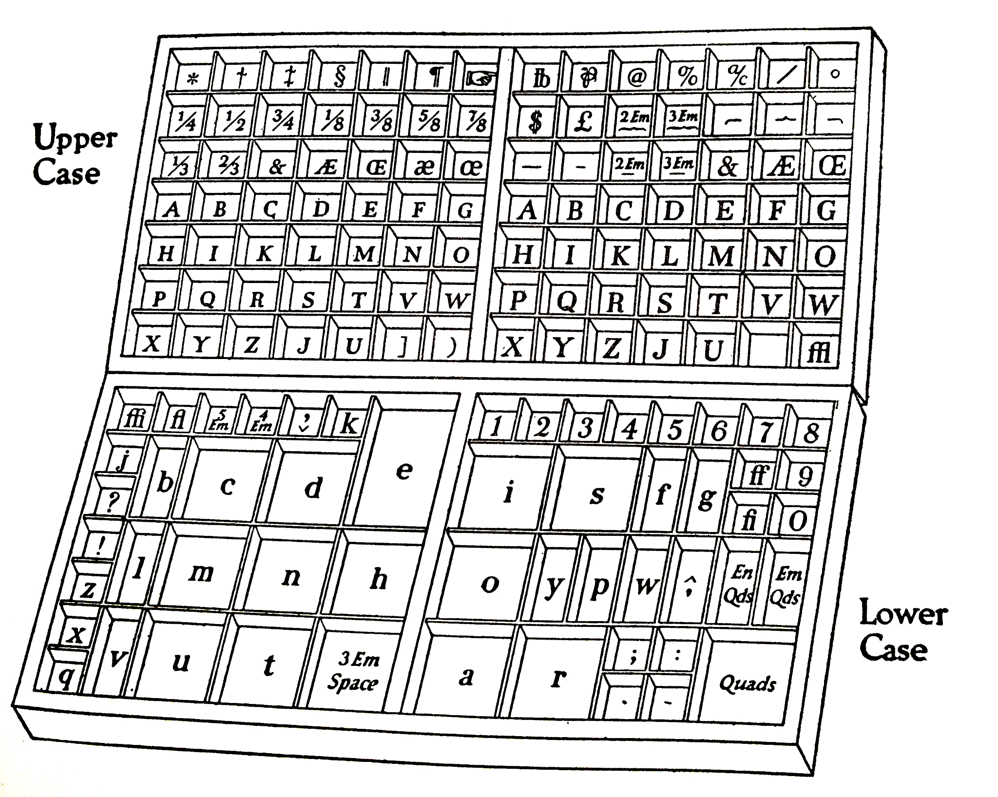
Compare Alfred Pearce’s type case engraving with the images below
Instead, the stories put across their moral and educational messages in subtle ways. Anyone reading this instalment of Reginald Cruden will have been introduced to life in the type composing room of a printing house. And children love the jargon of printer’s devils, upper case, lower case and composing sticks. Also, note the accuracy of Alfred Pearce’s illustration: compare it with the photograph and case diagram below.
Note the layout of the type cases (credit: Villa and Rose printing tray artworks)Layout of the letters (credit: Ned Batchelder blog/Printing Types, Updike, 1922)
The reason for the accuracy was that Reed was not just a writer of Boy’s Own yarns but an expert on typography. His family’s business was a typefoundry and he wrote a classic book, History of the Old English Letter Foundries.
Reginald Cruden: A Tale of City Life was published in book form, with illustrations by Pearse, in 1894 by the Religious Tract Society. The British Library catalogue lists 46 results for Reed, most of them the books based on his Boy’s Own stories, but also his History from 1887 (which was revised by Alfred Johnson, deputy keeper of printed books at the British Museum and author of the Encyclopaedia of Typefaces, in 1952). Other entries include ‘Old and new fashions in typography’, a paper he read at the Society of Arts in London in 1890.
Pearse was a prominent supporter of the suffragettes and produced posters and illustrations to support their cause.
The sacking of Steve Bell by the Guardian after a row over a Netanyahu cartoon says more about the problems at the newspaper than it does about the veteran cartoonist.
The Guardian’s page for the award-winning Steve Bell today
The Guardian lost the plot two decades ago with the massively expensive decision to switch from its broadsheet format into the smaller Berliner size, halfway between tabloid and broadsheet. It threw money at the redesign and the typography, and in buying full-colour presses that no-one else wanted to use.
Next, it was the online dog wagging the physical paper, with a sharp drop in the number – and particularly the breadth – of the stories. The newspaper simply became not worth buying. After 40 years of buying the Guardian, I found myself holding my political nose and buying the Times. And it’s the same on Sundays as well, with the Observer having become a weekend version of the daily Guardian.
The Guardian had to admit defeat in its Berliner experiment and move to a tabloid size with an ugly redesign in 2017. Not just ugly, but boring too.
The next retreat was from its King’s Cross offices in London back to Manchester.
So it may come as no surprise that the Guardian and Observer have kept their sales figures secret for the past two years. Well, actually, it is. The Manchester Guardian‘s reputation was built on its openness and a unique ownership structure that removes the need for an interfering proprietor. It was a newspaper revolution when the Guardian started a corrections and clarifications column, and developed the idea of the readers’ editor commenting on its own journalism from 1997. At one stage, it even put its morning news lists online and encouraged readers to get involved in the news editing process. Its style guide has been online for decades.
What will the present readers’ editor have to say about the Bell row? Probably nothing. There doesn’t appear to have been column since 2018.
Sacking Bell after 40 years is an insult both to him and the Guardian‘s traditions. He’s a cartoonist with a sense of history that has come through his pen since he made his name on Time Out and City Limits. The visceral works of Hogarth, Gillray, Rowlandson and Cruikshank going back to the 1700s are grist to his mill.
I haven’t seen the unpublished cartoon that someone on the paper is supposed to have linked to Shylock and described as ‘Jewish bloke; pound of flesh; antisemitic trope’. But I can believe Bell’s inspiration coming from a David Levine image from 1966 of US president Lyndon Johnson showing a Vietnam-shaped scar – one that the Guardian website reproduces (very badly) in its 2009 obituary of the American cartoonist. I’ve even talked on this blog about his referencing earlier cartoonists who inspire his works.
Whatever the merits of the argument, the Guardian looks, again, to have shot itself in the foot.
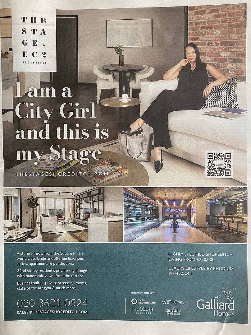
Flick through this weekend’s Sunday Times‘ Home supplement and there’s a page advert for The Stage, a new block of flats in London’s Shoreditch district. But look closely and see what’s on the coffee table – a copy of Jeremy Leslie’s book The Modern Magazine alongside a stack of actual magazines. Top of the pile is issue 6 of Friends on the Shelf, an independent literary title, with style guru Tyler Brûlé’s Monocle and two other titles below. Anyone recognise the bottom two?
Looks like magazines are back in fashion – and the stylist or photographer probably knows Jeremy’s MagCulture shop, which is about a mile west in Clerkenwell.
The name of the massive development comes not from The Stage magazine – which has its offices with The Bookseller on Bermondsey Street south of the Thames in SE1, but from the fact that the Shoreditch site includes the remains of Shakespeare’s Curtain Theatre.
Seaside activities shown in special Family Herald holiday number of 1877
A century ago, it was a bucket and spade for the kids. But a few days last week by the seaside in a converted Edwardian railway carriage has given me a different view of things. Buckets and spades were still in evidence but now many families had trolleys stacked with chairs, windbreakers, wakeboards, surf boards and paddle boards.
The special title of the 1877 seaside number of Family Herald above shows, from the left: children playing among rock pools; a couple under a parasol above a bay; fishermen; bathing huts; and a seaside town with its lighthouse. In the centre is the usual image on the Family Herald masthead, of Britannia sitting with her trident and Union flag shield defended by a lion.
Womans Life cover July 2, 1898, by Cecil Aldin
By 1898, the ‘grand double seaside number’ of Woman’s Life (July 2) shows that the idea of the bucket and spade was established, wielded by a child in front of a bathing hut on wheels. Another fashionable accessory is the parasol. The cover illustration is by Cecil Aldin, who would become famous for his hunting illustrations through magazines such as the Illustrated Sporting and Dramatic News and English Life in the next couple of decades.
Finally, on this August bank holiday weekend, the picture below shows a self-referential cover for the monthly Pall Mall magazine in June 1910. The woman in her first class carriage – just like the one I spent my holiday in – is waving a copy of the magazine she is depicted on. She’s off for the Whitsuntide holiday, which occurs on the seventh Sunday after Easter in the Christian calendar.
Self-referential cover for Pall Mall magazine in June 1910
The peregrinations of Victorian excursionists, as holidaymakers were known in the 1850s, were well recorded – and encouraged – by magazines, and the travel industry and publishers were symbiotic actors in creating today’s global travel industry.
Keane’s make-up brings to mind Chirgwin, a famous music hall act
Sky is running advertising for its sports coverage with the former footballer Roy Keane portrayed in theatrical make-up as part of the ‘greatest show on earth’. Commentators have described him as a clown, but the single, reversed-out diamond eye is more reminiscent of George Chirgwin, a famous Victorian music hall act.
Chirgwin in his signature costume on a Wills cigarette card
Chirgwin sang and played a banjo as ‘the White-Eyed Kaffir’. He had started as a black-face minstrel but has make-up developed into one eye painted white in a diamond shape. He wore a very tall hat and long white coat over a tight-fitting jersey and tights. The V&A Museum has a poster advertising a testimonial at London’s Oxford Music Hall in May 1911 to mark Chirgwin’s fifty years on the stage.
His trademark costume was parodied, as in the caricature of Lord Kitchener – who was well over six feet tall – by Tom Browne.
Lord Kitchener portrayed as Chirgwin by Tom Browne
Cantrell & Cochrane’s Belfast ginger ale advertised on the back cover of the World and His Wife in 1909
Cantrell & Cochrane may not be a household name today, but it gained a royal warrant from Edward VII, who had just gained the throne, in 1901. It had become the largest soft drinks maker in the world by the 1880s, thanks to extensive use of posters and advertising campaigns like the one above.
This back cover colour advert is from the World and His Wife, a sixpenny monthly ‘for gentlewomen’ dated May 1907. The publisher was Amalgamated Press, and the issue was printed at its Carmelite House offices south of Fleet Street in London.
Cantrell & Cochrane had bottling plants in Dublin and Belfast. The Joyce Project points to references to the drinks in James Joyce’s 1922 novel Ulysses. In the book, Leopold Bloom is wandering through Dublin on a hot day on his way to a funeral. He sees a poster for Cantrell and Cochrane’s Ginger Ale (Aromatic), and later in the same chapter he thinks of it as a ‘temperance beverage’ in relation to the use of wine in the Communion service.
The priest was rinsing out the chalice: then he tossed off the dregs smartly. Wine. Makes it more aristocratic than for example if he drank what they are used to Guinness’s porter or some temperance beverage Wheatley’s Dublin hop bitters or Cantrell and Cochrane’s ginger ale (aromatic). Doesn’t give them any of it: shew wine: only the other. Cold comfort. Pious fraud but quite right: otherwise they’d have one old booser worse than another coming along, cadging for a drink.
Note that the advert mentions the London agent for Cantrell & Cochrane, Findlater Mackie & Todd on London Bridge. This was a famous wine merchant that traded from premises near London Bridge station for 102 years until 1967. Such was the prominence of the building’s Beaux Arts glazed façade that the area was known locally as Findlater’s Corner. The frontage, featuring a clock with a ceramic stag’s head, has recently been restored.
Although Cantrell & Cochrane may not be a big name today, its products certainly are. They include Magners and Bulmers Irish ciders, Tennant’s lager, the Scottish brewer Innis & Gunn, and the Chinese beer Tsingtao.
The first Sunday Times colour section from 4 February 1962 (though the cover is not dated)
Home Chat, a leading women’s popular weekly, from 14 May
Weekly Illustrated magazine pioneered photojournalism (3 March 1936)
Kate Moss in Corinne Day photograph on cover of the Face in July 1990
The pointing man from an advert in London Opinion magazine, 17 September 1910
This logo from the Daily Mail echoes the original masthead for Answers Magazine
Diana Rigg as The Avengers’ Mrs Peel on the cover of TV World in 1965
John Gwynn’s poem ‘A Death Mask’ in the Strand magazine appears to have been inspired by a drowned woman in Paris
A colour cover for Crusoe magazine of January 1925
Mussolini writes for the right-wing Britannia magazine in 1927
Front cover title from Woman’s Own from 19 May 1955
Tom Browne’s drawing shoe incredible attention to detail; he could do so much with so little
Evil victim: Diana Rigg on the cover of the Sunday Times Magazine, 28 February 1982
A whacky contrast in all senses of the word from the previous week
Margaret Banks drew this charmer for Home Chat magazine in 1938. Note the baby is wearing reins
Je Suis Charlie – Charlie Hebdo’s website after the murderous attack on its Paris office
A letterpress flyer for the latest serial in Pictorial Magazine – could this 1902 image have sparked Alfred Leete’s imagination?
Hand-drawn title for Drawing magazine, February 1916
Town magazine and the`Girl in Red Water up to her Charlies’ cover from September 1965
The Kitchener poster shown in the third part of the Great War partwork in 1933
Racy illustration by Oldham for the weekly magazine Woman
Winnie the Pooh appeared exclusively in colour in six 1928 issues of Home Chat
Peter Hack-Brookes cover for Oz from September 1971 – a copy from a US magazine cover by Peter Driben from 1949
Cute cover-up: Naomi Campbell on the cover of GQ in April 2000
The glossy monthly Queen occupied the old Tit-Bits office in 1947
The first issue cover of John Bull from 1 April 1903
This is the cover for the relaunch of Woman’s Own in 1937 as a colour weekly. Note this is a true self referential cover because the woman is holding a copy of the magazine she appears on!
FHM June 2004. But what’s happened to the nipples on Abi Titmuss?
Acorn User magazine cover from December 1982. This issue would have been edited from the Bedford Square offices
John Bull in 1917 – the magazine was used as a promotional tool for Horatio Bottomley’s financial schemes
Look, spring 2009
Marilyn Monroe on the cover of Blighty from 1956
The return of the Daleks to Dr Who in 2005 sparked this gatefold cover for the Radio Times
Girl Illustrated front cover with Dr Who girl Katy Manning and a Dalek
Blighty pin-up cover for the popular men’s weekly by MB Tompkins in 1958 (16 August)
Woman’s Fair from January 1940 filled with content from the US, including a Jon Whitcomb cover illustration
Madonna on the front cover of Cosmopolitan magazine in the US for May 1990
Germany’s leader, Kaiser Wilhelm, with his flamboyant moustache and military uniform, at the start of World War I. He is described as ‘The Ravager’
Marc Jacobs 2014 Playboy special issue in perspex box
This 1946 holiday season cover from John Bull forecasts a web fate for the slumbering gent
This cat with its amazing, lip-licking tongue is from a Whiskas advert of 1964
Beautiful Britons glamour magazine first issue cover from November 1955
Last issue of Rupert Murdoch’s Today newspaper (17 November 1995)
The first issue cover for Carlos, an inflight magazine for Virgin in 2003
New Illustrated starts to change its name to Record Weekly in 1920 (January 17 issue)
Cover of Le Petit Journal of 25 June 1916
Racy French weekly Vie Parisienne from 1926
Chilprufe advert from Queen magazine in 1961
The first Daleks cover for Radio Times in November 1964
A Heartfield montage on the cover of Picture Post dated 9 September 1939
Marion Jean Lyon in 1923
Cover of BOAC’s inflight magazine Welcome Aboard in 1970
Leader magazine led the world in putting Marilyn Monroe on its cover in April 1946
Home Chat cover from 19 September 1914 with a front cover story about supporting the Queen’s Guild, which had been set up as a way for women to back the war effort
New Statesman 1993 jan 29 John Major Clare Latimer
Raphael Sabatini’s Captain Blood brought to visual life on the cover of Pearson’s Magazine (1930) by Joseph Greenup
Anna Wintour was told this Madonna cover would not sell
‘Mother Christmas’ cover for Needlewoman magazine from December 1925
‘K of K’ – Kitchener of Khartoum – caricature by Will Scott on the cover of Drawing magazine in February 1916
Vivian Blaine from the London stage adaption of the musical Guys and Dolls on the cover of Picture Post in 1953
One of Miss Fish’s drawings of Eve, from the popular Tatler column
Lilian Hocknell artwork revived for Christmas 2014 Vintage View from Woman’s Weekly magazine cover
Woman’s Own liked clean cover designs in the 1930s with few cover lines – but notice Ursula Bloom promoted her for a special article (30 July 1938)
Kate Greenaway painting called ‘Darby and Joan’ on Illustrated London News – or is this a pair of radical printers?
Popular Flying in 1934 when it was edited by Biggles creator WE Johns
A different look for the cover of Smash Hits, also in February 1984
An in-your-face spread from Loaded in May 1995
53 Bedford Square in London’s Bloomsbury. This Georgian building is up for sale at £12 million
HMS Queen Elizabeth super dreadnought by Harry Hudson Rodmell on the cover of New Illustrated magazine (18 October 1919)
The Observer Magazine cover shows Alexei Sayle as the Hitler diaries forger in the 1991 TV series Selling Hitler
The Penny Magazine shows itself being sold from what looks like a railway station stall in 1904
Detail of Helena Christiansen’s face from the Vogue cover
Eddie Hapgood, the England and Arsenal captain, on the cover of Weekly Illustrated in 1934 with his son, Tony
Madonna rides again on the cover of Cosmopolitan with its May 2015 issue
José Ferrer as Cyrano de Bergerac on this Everybody’s magazine cover from 10 October 1951. The design has a 3D effect, with the nose appearing to stand proud of the page
Billy Fury? James Dean?
Opening of 5-page article on the set of 2001: A Space Odyssey with sketches by Clive Arrowsmith in Town magazine
Debbie Harry and Blondie on the first issue cover of Smash Hits from November 1978
Ronald Searle’s cartoon glossary to printers’ jargon
Tatler magazine’s front cover in 1901
Karl Marx as the Uncle Sam derivative of Kitchener
Bovril advert of Hercules fighting a lion by Stanley Berkeley from Young Gentlewoman magazine of 1892
Strand magazine front cover from March 1891 by George Charles Haité


")


")


")


")
