Archive for the ‘magazine covers’ Category

1984: the year T-shirts went to war

August 22, 2020
katharine-hamnett-face-magazine-cover-1984_6jun-t-shirts.jpeg

Models wear Katharine Hamnett activist T-shirts on the June 1984 cover of The Face magazine

These days, T-shirts just seem to be covered in commercial logos or platitudes. Back in the 1980s, however, British fashion designer Katharine Hamnett made the activist T-shirt  a force to be reckoned with across the world.

katharine-hamnett-margaret-thatcher-face-magazine-1985-jan-t-shirts

Hamnett meets Thatcher

‘Stop Acid Rain’, ‘Worldwide Nuclear Ban Now’ and ‘Stop Killing Whales’ in huge black capital letters on white cotton were among her in-your-face slogans for 1984. 

Hamnett even brought her campaigning style to a Downing Street reception to promote Britain’s fashion business in March that year.

She wore one of her own T-shirts that yelled ‘58% don’t want Pershing’ to meet Margaret Thatcher. This was a reference to a US missile system being deployed in Europe. The prime minister is supposed to have remarked ‘We don’t have Pershings, we have cruise [missiles]’ as she shook hands with the designer.

Frankie Goes to Hollywood used Hamnett-style T-shirts to promote Two Tribes, the Liverpool band’s second single after Relax, in summer 1984. The slogans were ‘Frankie Say War! Hide Yourself’ and ‘Frankie Say Relax Don’t Do It!’ Both singles got to number one, as did The Power of Love at the end of the year. Three consecutive chart-topping  singles was a feat that not even the Beatles achieved.

Note the word ‘bodylicious’ on the Face cover at the top of the page. It was used 20 years later as the title of a top 10 Destiny’s Child single.

The Observer Magazine colour supplement did its own version of one of Hamnett’s designs for its New Year 1986 cover. Hamnett still does activist T-shirts today.

katharine-hamnett-observer-magazine-cover-1985-dec29.jpeg

Get a fix on 86: the Observer Magazine‘s take on Hamnett’s designs for its end of 1985 cover

Girls in champagne glasses

August 2, 2020

goldie-hawn-champagne-glass-playboy-magazine-1985-january

What is it about women celebrities sitting in champagne glasses? The US actress Goldie Hawn was shown in a champagne coupe by photographer Arny Freytag for the cover of Playboy magazine in January 1985. But she’s not the first, and probably won’t be the last, actress to be so portrayed.

Below, we have Kylie Minogue on the cover of fashion monthly Vogue in a suitably celebratory Christmas shot by Nick Knight as the ‘Princess of Pop’ (December 2003).

kylie-minogue-champagne-glass-vogue_2003-december

And Demi Moore was never one to be left out in the leggy glamour stakes, so took to the cover of the Observer Magazine (7 October 2007) after her divorce from Bruce Willis. This looks more like a glass globe seat than a champagne glass, but the look is very similar.

demi-moore-champagne-glass-observer_magazine_2007-oct7

And here’s a variation on the idea, going back 105 years. This 1915 cover of women’s weekly Home Notes was painted by no less than Mabel Lucie Attwell (May 29). Atwell’s cute toddlers were a favourite around the home on china and all sorts of goods for much of the 20th century.

Mabel Lucie Attwell 1915 Home Notes magazine

Mabel Lucie Attwell painted this 1915 cover of Home Notes with a cherub perched on a glass cup of custard

Finally, another illustration. This leering toff appeared inside the issues of the men’s monthly pocket magazine Razzle in the late 1940s, with a girl bubbling away in his glass.

woman-champagne-glass-razzle-magazine-1948


How Radio Times marked VE Day

May 8, 2020

radio-times-magazine-cover-1945-VE-day-Victory-Europe-May

This is the front cover of the Radio Times listing VE-Day celebrations in Britain to mark Germany’s surrender in May 1945. Special victory radio programmes on the BBC marked the week, celebrating each of the armed services and the civilian effort.

Beautifully illustrated as always, even the advertising, such as this Nestle advert, drawn, I reckon, by Mabel Lucie Attwell. She was an incredibly successful illustrator, renowned for her drawings of cute children.

radio-times-1945-may-10-Mabel-Lucie-Atwell-nestle-advert


Postwar crossword days at Elle

April 19, 2020

elle-magazine-cover-1947-october-21-paris-france-crossword-design

Today, Elle magazine is renowned as a glossy fashion monthly licensed by its French owners and published globally from New York to Moscow. But it has its origins as a general women’s weekly founded in postwar Paris.

The cover here is from 1947 (dated October 21). It’s unusual for its crossword-based design with the woman and background taken as a single photograph with the masthead title added later. The cross words act as cover lines, describing the attributes of the magazine: gay and practical, but with work spelled out twice as downward words.

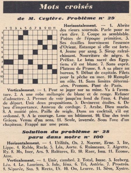
Inside was the actual mots croisés for the issue, which is reproduced below. Note the non-symmetrical grid, there being two or three clues for each words, and unusual numbering for the grid. In Britain, the crossword craze dates to the mid-1920s and the symmetrical shape and numbering style were ubiquitous in the 1930s.

The vertical numbers can just be seen on the left edge of the cover design, in Roman numerals. Answers on a postcard please …

elle-magazine-1947-october-21-crossword-mots-croises


Peter Rabbit and a magazine cover mystery

April 12, 2020
Royal_1904_3mar

Peter Rabbit lookalike on March 1904 Royal magazine cover

Beatrix Potter’s Tale of Peter Rabbit is one of the world’s best-selling books. It was a massive success after Frederick Warne & Co published the work in 1902 and within a year Peter Rabbit stuffed toys and other merchandising began to appear.

This uncredited Royal magazine cover dated March 1904 was undoubtedly part of that craze. A rabbit cover would usually be an unusual choice for a general interest monthly like the Royal a month before Easter Sunday, which was on April 3, but magazine publishers have always been good at jumping on bandwagons.

The illustration evokes Peter Rabbit without  referencing any of the story’s details, which would probably have triggered claims against Pearson’s, for copyright infringements.

ladies_home_1903_4aprIt turns out though, that not only was the illustration jumping on the Beatrix Potter bandwagon, but that it was a copy – or a licensed reproduction of – a cover by Frank Guild from the Ladies’ Home Journal, a US monthly, from Easter the year before.

The association of rabbits with Easter dates back to Eostra, the Anglo-Saxon goddess of spring and fertility, who was symbolised by a rabbit and was honoured on the spring equinox. Christians took on the festival as Easter.


Faces of fashion: Goalen and Shrimpton

April 8, 2020
super models Barbara Goalen and Jean Shrimpton

Barbara Goalen, the face of the 1950s, and Jean Shrimpton, the face of the Swinging Sixties

Barbara Goalen was chosen as personifying the style of 1952 by the Sunday Times Magazine for an issue marking 25 years since Elizabeth followed George VI as monarch.

This earlier Observer newspaper supplement above, dated 2 January 1966, again focuses on the arch-eyebrowed Goalen, contrasting her with Jean Shrimpton, the swinging face of fashion just 10 years later. In fact, Goalen gave up modelling in 1954 – 12 years before.

super model - mannequin - Barbara Goalen

Sunday Times magazine celebrates the style of 1952, as personified by Barbara Goalen (30 January _1977)

>>Sunday Times Magazine first issue

Black and white artists in London Opinion

March 5, 2020
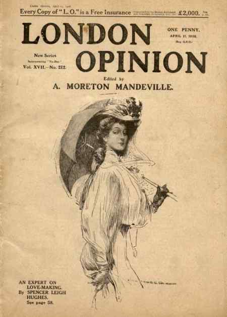
london-opinion-1908-april-11-p49.jpeg

London Opinion cover, dated 11 April 1908

London Opinion was a popular weekly magazine of the Edwardian period that was heavily illustrated by various black and white artists, such as Alfred ‘Your Country Needs You’ Leete and Bert ‘Are a Mo, Kaiser’ Thomas. This cover, dated 11 April 1908, is signed, but heaven knows what the signature says!

london-opinion-cover-1908-april-11-p49-signature.jpeg

The cover by the unknown illustrator is unusual in that it combines both line illustration and halftone. The halftone reproduction is reserved for the face.

london-opinion-cover-1908-april-11-p49-face-detail.jpeg

Halftone reproduction is only used for the face on this London Opinion cover

london-opinion-1908-april-11-p90-alfred-leete-signature.jpeg

At this stage, Leete does not appear to be one of the star illustrators, though he was regularly doing covers by 1914 when he did the Kitchener image that became the famous recruiting poster. He has at least three illustrations in this 1908 issue, judging by his signature with its dropped ‘T’.

london-opinion-1908-april-11-p90-alfred-leete-fashion-cartoon.jpeg

Alfred Leete’s signature can be seen on this cartoon


Magazine cover tricks: upside-down faces

January 15, 2020
Punch magazine front cover

Punch horror special from 1973: turn your screen upside-down!

Faces that can be turned upside-down to make another face have long been an illustrated  postcard gimmick, such as a Kaiser Bill card from World War I. They’re rarer on magazine covers, but here’s a Punch effort from 1973 for a horror special issue of the satirical weekly.

>>More cover design secrets

Harry Furniss: he Lika Joko

January 10, 2020
Lika Joko first issue cover

Lika Joko first issue cover in 1894. It was ‘conducted’ by Harry Furniss

Harry Furniss was a popular black and white artist of the late Victorian and Edwardian periods who launched his own magazine, Lika Joko in 1894 after he left Punch. The name was a pun on ‘like a joke’ and one of his noms-de-crayon. Like many periodicals of the time, the cover was dominated by advertising.

Note how Furniss portrays himself alongside the magazine’s title with his quill pen piercing the artist’s palette and the nib appearing to be covered in blood – the pen being mightier than the sword. He is dressed in a kimono with sheets of paper held in place at his back by the belt. The patterns on the kimono are formed from parts of his signature. The lettering of the title also has a Japanese feel. Furniss had produced a series of cartoons, ‘Our Japanneries’, under the name Lika Joko in 1888, pretending to be ‘the celebrated Japanese Artist … who is now on a visit to this country’. In the late Victorian period, Japan had a huge influence of art in Britain, resulting in a phenomenon known as Japonisme. Japan and Britain were great allies until World War II.

Illustration from Lika Joko editorial page: How Harry Furniss portrayed Mr Punch and Toby

How Harry Furniss portrayed Mr Punch and Toby in the Lika Joko editorial

On Punch, Furniss was renowned for his quick-fire caricatures of MPs in parliament for the Essence of Parliament pages, which were collated into books, but he turned his pen to all sorts of subjects and illustrated many books. RGG Price in his History of Punch (1957) says: ‘During the years of his Punch work, Harry Furniss dominated the pages. He was all over the place with jokes, illustrations, dramatic criticisms, headings and parliamentary sketches … It is said that he would chat to a man and caricature him on a pad held in his pocket.’

One of his cartoons in the satirical weekly was a spoof on advertising for A&F Pears (now part of Unilever), which used endorsements from celebrities such as the actress and notable beauty, Lillie Langtry, to sell its translucent amber soap. The spoof (26 April 1884) showed a tramp writing a letter saying:

I used your Soap two years ago; since then I have used no other.

Furniss and Punch fell out when the magazine sold the copyright in the drawing to Pears for use in advertising. Price describes Furniss as being ‘dictatorial and slick’ over the issue and the Punch people as ‘patient and disinterested’ in their correspondence. Despite this, the Pears advert was carried on the back cover of the first issue of Lika Joko – see at the bottom of this post – though with a slightly different caption. Pears used the Furniss cartoon advert at least for 16 years – I have a copy of it in a 1910 issue of TP’s Magazine.

pears_soap_bubbles_original_337_475.jpg pears_soap_bubbles_crop.jpeg

Pears took the Millais painting ‘A Child’s World’, added a bar of soap by the boy’s foot to advertising reproductions, and called it ‘Bubbles’

Pears famously turned another image, the painting ‘A Child’s World’ by the Pre-Raphaelite artist John Millais, into advertising – the  image became so famous because it was reproduced as colour lithographs millions of times over several decades. Thomas Barratt, the company’s managing director, bought the painting from Illustrated London News owner Sir William Ingram, who had reproduced it in the magazine as a colour poster for a Christmas issue. Pears had the image copied with a bar of its soap added and today we know it as ‘Bubbles’.

Barratt has been described as ‘the father of modern advertising’ for his innovative strategies. The boy in the painting was the artist’s grandson, Willie James, who later became a Royal Navy admiral. Like Pears’ soap, ‘Bubbles’ is now owned by Unilever and is on loan to the Lady Lever art gallery in Port Sunlight, on the Wirral. Copies of the colour advertising can be seen online from the V&A museum catalogue.

Pear's soap took the back page of Lika Joko with its Harry Furniss advertisement

Pears took the back page of Lika Joko with its Harry Furniss advert

Lika Joko lasted for just 26 issues, from 20 October 1894 to 13 April 1895. Price describes how Furniss was refused a gallery ticket to parliament for Lika Joko – a disaster for a political caricaturist – and that this proved fatal to the paper. Later, Furniss went to the US, where the Internet Movie Database lists him as directing, writing and appearing in three films for Edison Studios, a company controlled by the inventor Thomas Edison: The Mighty Hunters and The Artist’s Joke (1912), and Rival Reflections (1914). Furniss returned to Britain and has been credited with helping to pioneer animated cartoon films in 1914 with War Cartoons and Peace and Pencillings. The BFI credits Furniss on 15 films.

There is a short film online at Brighton University, Winchelsea and its Surroundings. A Day with Harry Furniss and his Sketchbook, which shows Furniss at the cottage of Helen Terry and painting the actress. Other scenes are filmed in Winchelsea and Hastings.

Price reckons Furniss made a lot of money but lost most of it to making films. He died in 1925, in the seaside town of Hastings, where he is buried.

The National Portrait Gallery has a self-portrait of Furniss and more than 450 of his sketches for sale online as prints.

>> Harry Furniss profile in Tit-Bits, alongside Sir Leslie Ward (‘Spy’ of Vanity Fair) and the theatrical caricaturist Alfred Bryan

>> More on Punch, a weekly satirical magazine that lasted 150 years


To see almost 500 magazine covers and pages, look out for my book, A History of British Magazine Design, from the Victoria & Albert Museum, the world’s leading museum of art and design


‘New Women in a New World’

January 1, 2020
Home Notes magazine cover in 1910 had high hoped for 'New Women in a New World'

Home Notes in 1910 had high hopes for ‘New Women in a New World’

Let’s just keep the New Year celebrations going. Here’s how the women’s weekly Home Notes saw things in 1910 – ‘New Women in a New World’.

The first decade of the 20th century witnessed the growth of the women’s suffrage movement. In 1903, Emmeline Pankhurst had founded the Women’s Social and Political Union. As feminist frustrations grew during the decade, suffragettes turned to smashing windows in Downing Street, mass demonstrations, and in 1909 prison hunger strikes. There were high hopes in 1910 that the Conciliation bill would give the vote to a million property-owning women, but it did not become law. In November, suffragettes marched on parliament, where they were brutally treated by police on ‘Black Friday’.