Archive for the ‘1900s’ Category

Chubb banks vaults in Chambers’s Magazine

June 10, 2020

chamberss-magazine-1924-august-chubb-bank-vault-advert

It’s not often anyone gets to go in a Goldfinger-style bank vault, but pay a visit to Lisbon’s Museum of Design & Fashion and you’ll find yourself in one.

The museum is housed in a former bank. On the ground floor, you can stroll past  clothing, accessories, household goods and furniture – and the pair of Vivienne Westwood platforms that brought Naomi Campbell tumbling down on the catwalk in 1993.

The underground vault and upper floor host temporary exhibitions, with jewellery on display in the old steel safe deposit boxes.

The vault, built for the Banco Nacional Ultramarino, is just like the one shown in this advertising insert from a 1924 copy of Chambers’s Journal (August 1). And it was made by Chubb – you can see a chub fish symbol engraved in the side of the crane hinge door as you walk in, as well as the usual branding. British vaults made by Chubb, or Tann, its main rival, can be found in central banks across the world. Today, however, Chubb only exists as a brand name on locks and alarms.

Of course, there were probably not that many bank vault owners reading Chambers’s Journal, but the reverse of the insert promotes Chubb’s domestic and commercial products. The insert was printed offset by George Stewart & Co in Edinburgh.

Chambers’s Edinburgh Journal was a weekly founded in 1832 in Edinburgh by William Chambers. In 1854, the publishing offices moved to 47 Paternoster Row in London, an area near St Paul’s Cathedral that was then the centre of the English book trade. The title was expanded to Chambers’s Journal of Popular Literature, Science, and Arts. The title shrank again in 1897 and the magazine survived to pass its centenary, but closed in 1956. Chambers’s English Dictionary was founded in 1872 and is today an imprint published by Hodder & Stoughton.

chamberss-magazine-1924-august-chubb-bank-vault-advert


Peter Rabbit and a magazine cover mystery

April 12, 2020
Royal_1904_3mar

Peter Rabbit lookalike on March 1904 Royal magazine cover

Beatrix Potter’s Tale of Peter Rabbit is one of the world’s best-selling books. It was a massive success after Frederick Warne & Co published the work in 1902 and within a year Peter Rabbit stuffed toys and other merchandising began to appear.

This uncredited Royal magazine cover dated March 1904 was undoubtedly part of that craze. A rabbit cover would usually be an unusual choice for a general interest monthly like the Royal a month before Easter Sunday, which was on April 3, but magazine publishers have always been good at jumping on bandwagons.

The illustration evokes Peter Rabbit without  referencing any of the story’s details, which would probably have triggered claims against Pearson’s, for copyright infringements.

ladies_home_1903_4aprIt turns out though, that not only was the illustration jumping on the Beatrix Potter bandwagon, but that it was a copy – or a licensed reproduction of – a cover by Frank Guild from the Ladies’ Home Journal, a US monthly, from Easter the year before.

The association of rabbits with Easter dates back to Eostra, the Anglo-Saxon goddess of spring and fertility, who was symbolised by a rabbit and was honoured on the spring equinox. Christians took on the festival as Easter.


The art in advertising

March 26, 2020
Edwards' Harlene hair dressing advert 1902

Edwards’ Harlene hair dressing advert from 1902

Engraved advertising in Victorian and Edwardian magazines looks so dramatic with its hard back and white lines, particularly as the big brands employed some of the best illustrators.

This engraving is from a page advert in Alfred Harmsworth’s London, a monthly magazine, dated June 1902. The face in the unsigned illustration for Edwards’ Harlene hair dressing has the look of a painting or leaded window by the Pre-Raphaelite Edward Burne Jones. Overall, the image is influenced by the works of Alphonse Mucha and Art Nouveau, with detailed patterning for the clothes and background; everything, except, ironically, for the snaking hair itself.

The Wellcome Library has a chromolitho print of the Harlene artwork without the text from the lower part of the advert.

It was clearly a brand that took advertising very seriously with celebrity recommendations by music hall artiste Lillie Langtry and, it seems, half the royal houses in Europe. But then, Harlene was a miracle potion, promising that it:

Restores the hair,
promotes the growth,
arrests the fall,
strengthens the roots,
removes dandruff,
beautifies the hair.

London-1902-harlene-head-of-hair

Pre-Raphaelite face in the engraving

The Art of Advertising exhibition was to open at Oxford’s Bodleian library this month, but has been postponed. It tells the story of British advertising from the mid 18th century to the 1930s based on the John Johnson collection of printed ephemera.

Other places to research advertising imagery include the History of Advertising Trust, the Maurice Rickards collection and the Advertising Archives.

>>More about magazines at Magforum.com

Black and white artists in London Opinion

March 5, 2020
london-opinion-1908-april-11-p49.jpeg

London Opinion cover, dated 11 April 1908

London Opinion was a popular weekly magazine of the Edwardian period that was heavily illustrated by various black and white artists, such as Alfred ‘Your Country Needs You’ Leete and Bert ‘Are a Mo, Kaiser’ Thomas. This cover, dated 11 April 1908, is signed, but heaven knows what the signature says!

london-opinion-cover-1908-april-11-p49-signature.jpeg

The cover by the unknown illustrator is unusual in that it combines both line illustration and halftone. The halftone reproduction is reserved for the face.

london-opinion-cover-1908-april-11-p49-face-detail.jpeg

Halftone reproduction is only used for the face on this London Opinion cover

london-opinion-1908-april-11-p90-alfred-leete-signature.jpeg

At this stage, Leete does not appear to be one of the star illustrators, though he was regularly doing covers by 1914 when he did the Kitchener image that became the famous recruiting poster. He has at least three illustrations in this 1908 issue, judging by his signature with its dropped ‘T’.

london-opinion-1908-april-11-p90-alfred-leete-fashion-cartoon.jpeg

Alfred Leete’s signature can be seen on this cartoon


Harry Furniss: he Lika Joko

January 10, 2020
Lika Joko first issue cover

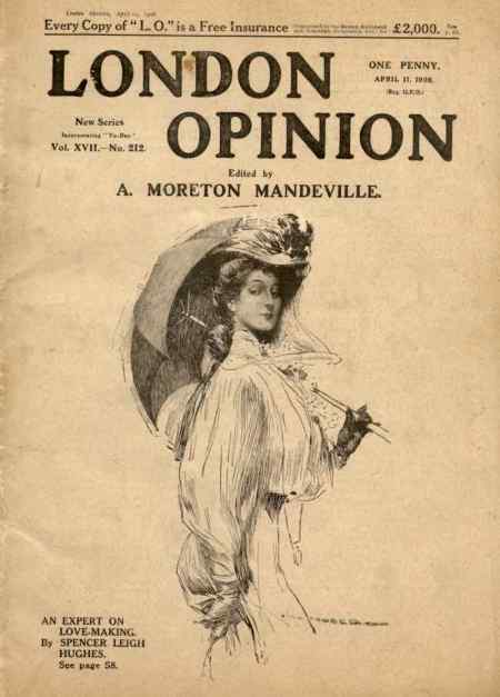
Lika Joko first issue cover in 1894. It was ‘conducted’ by Harry Furniss

Harry Furniss was a popular black and white artist of the late Victorian and Edwardian periods who launched his own magazine, Lika Joko in 1894 after he left Punch. The name was a pun on ‘like a joke’ and one of his noms-de-crayon. Like many periodicals of the time, the cover was dominated by advertising.

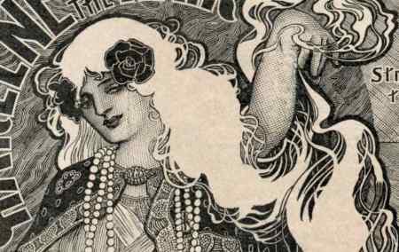
Note how Furniss portrays himself alongside the magazine’s title with his quill pen piercing the artist’s palette and the nib appearing to be covered in blood – the pen being mightier than the sword. He is dressed in a kimono with sheets of paper held in place at his back by the belt. The patterns on the kimono are formed from parts of his signature. The lettering of the title also has a Japanese feel. Furniss had produced a series of cartoons, ‘Our Japanneries’, under the name Lika Joko in 1888, pretending to be ‘the celebrated Japanese Artist … who is now on a visit to this country’. In the late Victorian period, Japan had a huge influence of art in Britain, resulting in a phenomenon known as Japonisme. Japan and Britain were great allies until World War II.

Illustration from Lika Joko editorial page: How Harry Furniss portrayed Mr Punch and Toby

How Harry Furniss portrayed Mr Punch and Toby in the Lika Joko editorial

On Punch, Furniss was renowned for his quick-fire caricatures of MPs in parliament for the Essence of Parliament pages, which were collated into books, but he turned his pen to all sorts of subjects and illustrated many books. RGG Price in his History of Punch (1957) says: ‘During the years of his Punch work, Harry Furniss dominated the pages. He was all over the place with jokes, illustrations, dramatic criticisms, headings and parliamentary sketches … It is said that he would chat to a man and caricature him on a pad held in his pocket.’

One of his cartoons in the satirical weekly was a spoof on advertising for A&F Pears (now part of Unilever), which used endorsements from celebrities such as the actress and notable beauty, Lillie Langtry, to sell its translucent amber soap. The spoof (26 April 1884) showed a tramp writing a letter saying:

I used your Soap two years ago; since then I have used no other.

Furniss and Punch fell out when the magazine sold the copyright in the drawing to Pears for use in advertising. Price describes Furniss as being ‘dictatorial and slick’ over the issue and the Punch people as ‘patient and disinterested’ in their correspondence. Despite this, the Pears advert was carried on the back cover of the first issue of Lika Joko – see at the bottom of this post – though with a slightly different caption. Pears used the Furniss cartoon advert at least for 16 years – I have a copy of it in a 1910 issue of TP’s Magazine.

pears_soap_bubbles_original_337_475.jpg pears_soap_bubbles_crop.jpeg

Pears took the Millais painting ‘A Child’s World’, added a bar of soap by the boy’s foot to advertising reproductions, and called it ‘Bubbles’

Pears famously turned another image, the painting ‘A Child’s World’ by the Pre-Raphaelite artist John Millais, into advertising – the  image became so famous because it was reproduced as colour lithographs millions of times over several decades. Thomas Barratt, the company’s managing director, bought the painting from Illustrated London News owner Sir William Ingram, who had reproduced it in the magazine as a colour poster for a Christmas issue. Pears had the image copied with a bar of its soap added and today we know it as ‘Bubbles’.

Barratt has been described as ‘the father of modern advertising’ for his innovative strategies. The boy in the painting was the artist’s grandson, Willie James, who later became a Royal Navy admiral. Like Pears’ soap, ‘Bubbles’ is now owned by Unilever and is on loan to the Lady Lever art gallery in Port Sunlight, on the Wirral. Copies of the colour advertising can be seen online from the V&A museum catalogue.

Pear's soap took the back page of Lika Joko with its Harry Furniss advertisement

Pears took the back page of Lika Joko with its Harry Furniss advert

Lika Joko lasted for just 26 issues, from 20 October 1894 to 13 April 1895. Price describes how Furniss was refused a gallery ticket to parliament for Lika Joko – a disaster for a political caricaturist – and that this proved fatal to the paper. Later, Furniss went to the US, where the Internet Movie Database lists him as directing, writing and appearing in three films for Edison Studios, a company controlled by the inventor Thomas Edison: The Mighty Hunters and The Artist’s Joke (1912), and Rival Reflections (1914). Furniss returned to Britain and has been credited with helping to pioneer animated cartoon films in 1914 with War Cartoons and Peace and Pencillings. The BFI credits Furniss on 15 films.

There is a short film online at Brighton University, Winchelsea and its Surroundings. A Day with Harry Furniss and his Sketchbook, which shows Furniss at the cottage of Helen Terry and painting the actress. Other scenes are filmed in Winchelsea and Hastings.

Price reckons Furniss made a lot of money but lost most of it to making films. He died in 1925, in the seaside town of Hastings, where he is buried.

The National Portrait Gallery has a self-portrait of Furniss and more than 450 of his sketches for sale online as prints.

>> Harry Furniss profile in Tit-Bits, alongside Sir Leslie Ward (‘Spy’ of Vanity Fair) and the theatrical caricaturist Alfred Bryan

>> More on Punch, a weekly satirical magazine that lasted 150 years


To see almost 500 magazine covers and pages, look out for my book, A History of British Magazine Design, from the Victoria & Albert Museum, the world’s leading museum of art and design


The innovative past of magazines

August 6, 2018

Boy’s Own Paper from January 1908

There much talk of innovation in the publishing industry at the moment, but an often-overlooked place for ideas is the past 150 years of magazine publishing. And here’s one from the Boy’s Own Paper (BOP).

Until the Second World War, a strategy for some magazines was to publish a magazine as a weekly, and then collate those four issues as a monthly, and also as a complete annual.

So, this BOP from Jan 1908 is actually the December issues with their covers removed, some fresh advertising pages and all in a new wrapper. The price was half as much again as for the four weekly issues at 6d. However, the part carried ‘added value’ in the form of a fold-out colour plate.

The plate was of a painting, ‘Companions in Tribulation’ by Miss N. Joshua, which showed two men in the stocks. It was printed separately by Tom Browne & Co in Nottingham, a colour lithographic printer founded by Tom Browne, then one of most famous cartoonists.

Artists, their signatures and monograms

April 12, 2018

Alfred Leete's monogram

Alfred Leete’s monogram

Alfred Leete, creator of the Your Country Needs You poster of Kitchener, had a distinctive signature for his work, as did one of his artistic contemporaries, Lawson Wood, the creator of the Gran’pop chimpanzee character. Both were famous illustrators and in both cases, the signature evolved over time.

Richard 'Dicky' Doyle's monogram on Punch

Richard ‘Dicky’ Doyle’s monogram from Punch

Other illustrators and cartoonists used a monogram, a graphic device made up of their initials. A great example of this was the Punch illustrator Richard Doyle. He used a reversed R to share the upright of the D, with a bird on top to symbolise his nickname, Dicky Doyle. Monograms seem to have become less popular in the 20th century, but Simon House has a spread of Victorian examples in his book, The Dictionary of 19th Century British Book Illustrators.

Leete’s and Wood’s signatures are easy to make out, whereas Doyle’s is a rebus. However, some cartoonists’ signatures seem perverse in their illegibility – Gilbert Wilkinson being a prime example with his covers for Passing Show and Illustrated weekly magazines.

To help get my head round them all, I’ve started a page of signatures and monograms on Magforum with 100 examples. Another illegible example is East on a Health & Efficiency cover – pointers as to what it says or in identifying some others would be appreciated!

east monogram from 1928 Health and Efficiency

Illegible signature for part of ‘East’


To see almost 500 magazine covers and pages, look out for my book, A History of British Magazine Design, from the Victoria & Albert Museum, the world’s leading museum of art and design


This month in magazines: The Strand’s albatross cover

February 7, 2017

The Strand magazine cover from February 1930 - note the mini cover at the bottom right

February 1930: The Strand magazine with a mini cover at the bottom right and the Oxo advertising sign

The Strand magazine was first published by George Newnes in 1891 and was an immediate hit – establishing both itself and Sherlock Holmes in the world’s imagination. Even today, it is the world’s most collectable magazine. A set of all 75 issues with Sherlock Holmes stories is likely to set you back £50,000.

Raphael Sabitini's Captain Blood on the cover of Pearsons, January 1930

Competition fromRaphael Sabitini’s Captain Blood on the cover of Pearsons, January 1930

Its initial cover design by George Haité became an icon and, like Punch and The Wide World, was used for a long time. However, the iconic cover became an albatross around the magazine’s neck. The reason for this is that the magazine industry thrives on change, but readers hate change! Managing this dilemma is one of the great skills of an editor, but usually involves some painful decisions that will upset the most loyal readers.

As an earlier post explained, The Strand cover evolved. First, an advertising panel was introduced on the top left, then images were inset over the traffic on the right side. In the 1920s, colour was introduced and the street scene moved around the Covent Garden area that The Strand thoroughfare bounds. But by 1930, there was a lot of monthly competition with arresting, colour covers, such as Pearson’s. And the last of the Holmes stories had been published in 1927.

The Strand magazine of May 1922 with a colour cover and a Covent Garden flower seller

The Strand of May 1922

So the February 1930 tradition was an attempt to break with the past – it depicts a scene inside a restaurant, presumably on The Strand, with the Oxo hoarding seen in its familiar place through the window.

However, there must have been angst in the office, and it was Herbert Greenhough Smith’s last year in the editorial chair – after 40 years! At any rate, they felt they still had to show the usual cover, which was an updated colour version of Haité’s original work, in a panel. And they then reverted to that version – which dated back to 1921 – for the next two years, with a Covent Garden flower seller in the foreground and cars rather than carriages in the road.


To see almost 500 magazine covers and pages, look out for my book, A History of British Magazine Design, from the Victoria & Albert Museum, the world’s leading museum of art and design


Walter Groves – Cycling magazine’s cartoonist ‘conductor’

December 27, 2016

Cycling, the weekly magazine, from 6 June 1899

Cycling, a pioneering weekly magazine, from 6 June 1899

I frequently find myself on Steve Holland’s Bear Alley, a great blog for discovering artists who worked on magazines and comics. One post that caught my eye was about Raymond Groves, a motorsports cartoonist, who is described as ‘the second son of Walter Groves, the founding editor of The Motor‘.

Cartoon by Walter Groves from Cycling, 7 July 1899

Cartoon by Walter Groves from Cycling, 7 July 1899

Walter Groves did indeed found one of the first motoring titles, but he made his name on an earlier weekly magazine at Temple Press, Cycling, which he ‘conducted’ with Edmund Dangerfield. (Another keen cyclist who wrote for Cycling was Alfred Harmsworth; he later launched Answers and the Daily Mail and became the arch press baron, Lord Northcliffe.)

Titlepiece from Cycling & Moting, 20 December 1905

Titlepiece from Cycling & Moting, 20 December 1905, conducted by Edmund Dangerfield and Walter Groves

And Walter Groves not only ran Cycling, but did his own cartoons. He was clearly reluctant to leave the title after the advent of The Motor. By 1905 Cycling was called Cycling & Moting, and he was still conducting it with Dangerfield.

The Autocar, published by Illiffe & Son from November 1895 was the first magazine to specialise in motoring and The Motor followed from Temple Press in 1902, initially as Motorcycling & Motoring. Temple Press became part of IPC in the 1960s. Motor finally succumbed to Autocar in 1988.

Cycling now has 125 years under its belt. It is known as Cycling Weekly, and is published by Time Inc (UK).


The eyes of a magazine

December 4, 2016

David Moyes's eyes cropped from an issue of the Sun in 2014 (April 23)

David Moyes’s eyes cropped from an issue of the Sun in 2014 (April 23)

Former Everton manager David Moyes is back on the TV as manager of Sunderland, but whenever I see his face, I’m reminded of the Pictorial Magazine poster below.

Pictorial Magazine poster from 1902

Pictorial Magazine poster from 1902

The poster promoted the start of a new serial – ‘The House with the Scarlet Knocker’ – in the May 2 issue that year.


To see almost 500 magazine covers and pages, look out for my book, A History of British Magazine Design, from the Victoria & Albert Museum, the world’s leading museum of art and design