Archive for the ‘notable covers’ Category

1984: the year T-shirts went to war

August 22, 2020
katharine-hamnett-face-magazine-cover-1984_6jun-t-shirts.jpeg

Models wear Katharine Hamnett activist T-shirts on the June 1984 cover of The Face magazine

These days, T-shirts just seem to be covered in commercial logos or platitudes. Back in the 1980s, however, British fashion designer Katharine Hamnett made the activist T-shirt  a force to be reckoned with across the world.

katharine-hamnett-margaret-thatcher-face-magazine-1985-jan-t-shirts

Hamnett meets Thatcher

‘Stop Acid Rain’, ‘Worldwide Nuclear Ban Now’ and ‘Stop Killing Whales’ in huge black capital letters on white cotton were among her in-your-face slogans for 1984. 

Hamnett even brought her campaigning style to a Downing Street reception to promote Britain’s fashion business in March that year.

She wore one of her own T-shirts that yelled ‘58% don’t want Pershing’ to meet Margaret Thatcher. This was a reference to a US missile system being deployed in Europe. The prime minister is supposed to have remarked ‘We don’t have Pershings, we have cruise [missiles]’ as she shook hands with the designer.

Frankie Goes to Hollywood used Hamnett-style T-shirts to promote Two Tribes, the Liverpool band’s second single after Relax, in summer 1984. The slogans were ‘Frankie Say War! Hide Yourself’ and ‘Frankie Say Relax Don’t Do It!’ Both singles got to number one, as did The Power of Love at the end of the year. Three consecutive chart-topping  singles was a feat that not even the Beatles achieved.

Note the word ‘bodylicious’ on the Face cover at the top of the page. It was used 20 years later as the title of a top 10 Destiny’s Child single.

The Observer Magazine colour supplement did its own version of one of Hamnett’s designs for its New Year 1986 cover. Hamnett still does activist T-shirts today.

katharine-hamnett-observer-magazine-cover-1985-dec29.jpeg

Get a fix on 86: the Observer Magazine‘s take on Hamnett’s designs for its end of 1985 cover

Girls in champagne glasses

August 2, 2020

goldie-hawn-champagne-glass-playboy-magazine-1985-january

What is it about women celebrities sitting in champagne glasses? The US actress Goldie Hawn was shown in a champagne coupe by photographer Arny Freytag for the cover of Playboy magazine in January 1985. But she’s not the first, and probably won’t be the last, actress to be so portrayed.

Below, we have Kylie Minogue on the cover of fashion monthly Vogue in a suitably celebratory Christmas shot by Nick Knight as the ‘Princess of Pop’ (December 2003).

kylie-minogue-champagne-glass-vogue_2003-december

And Demi Moore was never one to be left out in the leggy glamour stakes, so took to the cover of the Observer Magazine (7 October 2007) after her divorce from Bruce Willis. This looks more like a glass globe seat than a champagne glass, but the look is very similar.

demi-moore-champagne-glass-observer_magazine_2007-oct7

And here’s a variation on the idea, going back 105 years. This 1915 cover of women’s weekly Home Notes was painted by no less than Mabel Lucie Attwell (May 29). Atwell’s cute toddlers were a favourite around the home on china and all sorts of goods for much of the 20th century.

Mabel Lucie Attwell 1915 Home Notes magazine

Mabel Lucie Attwell painted this 1915 cover of Home Notes with a cherub perched on a glass cup of custard

Finally, another illustration. This leering toff appeared inside the issues of the men’s monthly pocket magazine Razzle in the late 1940s, with a girl bubbling away in his glass.

woman-champagne-glass-razzle-magazine-1948


How Radio Times marked VE Day

May 8, 2020

radio-times-magazine-cover-1945-VE-day-Victory-Europe-May

This is the front cover of the Radio Times listing VE-Day celebrations in Britain to mark Germany’s surrender in May 1945. Special victory radio programmes on the BBC marked the week, celebrating each of the armed services and the civilian effort.

Beautifully illustrated as always, even the advertising, such as this Nestle advert, drawn, I reckon, by Mabel Lucie Attwell. She was an incredibly successful illustrator, renowned for her drawings of cute children.

radio-times-1945-may-10-Mabel-Lucie-Atwell-nestle-advert


Peter Rabbit and a magazine cover mystery

April 12, 2020
Royal_1904_3mar

Peter Rabbit lookalike on March 1904 Royal magazine cover

Beatrix Potter’s Tale of Peter Rabbit is one of the world’s best-selling books. It was a massive success after Frederick Warne & Co published the work in 1902 and within a year Peter Rabbit stuffed toys and other merchandising began to appear.

This uncredited Royal magazine cover dated March 1904 was undoubtedly part of that craze. A rabbit cover would usually be an unusual choice for a general interest monthly like the Royal a month before Easter Sunday, which was on April 3, but magazine publishers have always been good at jumping on bandwagons.

The illustration evokes Peter Rabbit without  referencing any of the story’s details, which would probably have triggered claims against Pearson’s, for copyright infringements.

ladies_home_1903_4aprIt turns out though, that not only was the illustration jumping on the Beatrix Potter bandwagon, but that it was a copy – or a licensed reproduction of – a cover by Frank Guild from the Ladies’ Home Journal, a US monthly, from Easter the year before.

The association of rabbits with Easter dates back to Eostra, the Anglo-Saxon goddess of spring and fertility, who was symbolised by a rabbit and was honoured on the spring equinox. Christians took on the festival as Easter.


Magazine cover tricks: upside-down faces

January 15, 2020
Punch magazine front cover

Punch horror special from 1973: turn your screen upside-down!

Faces that can be turned upside-down to make another face have long been an illustrated  postcard gimmick, such as a Kaiser Bill card from World War I. They’re rarer on magazine covers, but here’s a Punch effort from 1973 for a horror special issue of the satirical weekly.

>>More cover design secrets

See how far attitudes on race have changed

December 9, 2019
Times-Magazine-cover-2019_12-december-7-Sathnam-Sanghera

Times writer Sathnam Sanghera took the family on a Christmas treat to a manor house

How far has Britain come in its attitudes to race? That was the question sparked in my mind by this Times Magazine cover on Saturday illustrating an article by Sathnam Sanghera. Compare it with this 1968 cover:

Nova-magazine-cover- on racism-and-immigration-1968.jpeg

Nova magazine from August 1968, soon after Enoch Powell’s Rivers of Blood speech

The Nova issue from August 1968 set out to challenge racist attitudes. This was just five months after Enoch Powell gave his notorious Rivers of Blood speech to a Conservative party meeting in Birmingham. That year had seen the passing of the Commonwealth Immigrants Act. The new law meant migrants had to have a job before they arrived, to possess special skills or meet specific needs in the labour market. The tightening up of the law had come after campaigning by the likes of Powell since the arrival in 1965 of refugees from Uganda fleeing the murderous regime of Idi Amin.

For the first time, immigration laws required migrants to  be connected by birth or ancestry to a UK national, so keeping out people from the Commonwealth who had fought Britain’s wars for 200 years. This was just 20 after after the end of World War Two, when two and a half million men from India alone fought. Of them, 100,000 were killed or injured. Thirty-one were awarded the Victoria Cross.

You won’t see a cover like that 1968 issue of IPC’s Nova on any monthly woman’s magazine today. But then, Nova was groundbreaking in its editorial strategy of mixing controversy with fashion – whether it be abortion, racism, gay rights or the Pill – and the ability of its team to pull off such ideas. It even had the nerve to dress the Queen in Paris fashions!

The book Nova 1965 – 1975 celebrating the ‘thinking woman’s magazine’ and compiled by David Hillman and Harri Peccinotti has recently been reissued. At £26, that’s probably half what you’ll pay for a copy of the original on eBay.

>> See all Nova magazine’s legendary covers, 1965-1975 

Magazines in the movies: Playboy in Kubrick’s Dr Strangelove

November 7, 2019
dr-strangelove-playboy-magazine-centrefold

A pilot in Dr Strangelove reading Playboy. The Playmate pin-up has a copy of Foreign Affairs  preserving her modesty

Stanley Kubrick’s Dr Strangelove is the latest film that’s come to my attention using a magazine on the big screen, in this case – along with the likes of Steven Seagal and James Bond – a copy of Playboy.

Kubrick is famed for his attention to detail and a pilot in the cockpit of a B-52 Stratofortress reading the issue of Playboy from June 1962 is a classic example of this trait. 

playboy-magazine-1962-june-bikini-cover

Playboy‘s controversial cover: ‘A toast to bikinis’ 

How I Learned to Stop Worrying and Love the Bomb, to give the 1964 film its alternative title, was making a nod to the atom-bomb reference in Playboy‘s only cover line for June 1962, ‘A toast to bikinis’, and the cover photo of a woman’s torso and her bikini bottom.

Louis Réard, the French engineer who invented the two-piece swimsuit in 1946, named it after Bikini atoll, where the US had just set off the first of 23 nuclear bombs it would detonate there until 1958.

The photo by Marvin E Newman was regarded as controversial and promoted a series of his images on the theme of how bikinis were finally reaching US shores from Europe.

The reference is reinforced by a shot of what appears to be the issue’s Playmate of the Month fold-out pin-up. This shows a woman lying face down on a rug with a copy of Foreign Affairs magazine covering her derrière! If you reckon the appearance of a copy of that esoteric magazine for diplomats  is odd, you’d be right, because the actual Playmate for June was Merissa Mathes, a US model and actress photographed by Glenn Otto.

According to IMDB, the centrefold being read by the pilot of the nuclear bomber was posed by Tracy Reed, the only woman in the film, and specially mocked up. She was billed in some early adverts as ‘Miss Foreign Affairs’, a reference to the scene. In the actual movie, she plays Miss Scott, the secretary to George C. Scott’s character, General ‘Buck’ Turgidson.

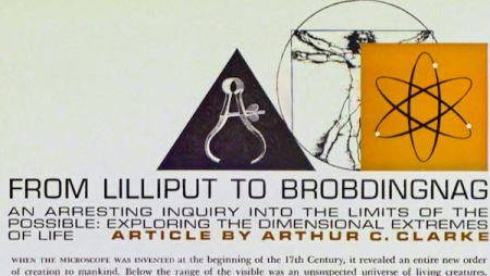
playboy-1962-From-Lilliput-to-Brobdingnad-Arthur-C-Clarke

Headline for ‘From Lilliput to Brobdingnad’ by the sci-fi writer Arthur C Clarke 

But the filmic links from that copy of Playboy don’t end there, for the issue also contains an article, ‘From Lilliput to Brobdingnad’ by the British science fiction writer Arthur C Clarke. He later worked with Kubrick on the seminal book and film 2001: A Space Odyssey, which was released in 1968. And 2001 was in turn featured in Town magazine.

Dr Strangelove is an amazing film, shot like most of Kubrick’s later films in Britain, in this case at Shepperton Studios in Surrey. It’s a rare surreal comedy by Kubrick, but, as with all his films, has great characters – such as Peter Sellars as the mad Nazi scientist – and superb dialogue. I love the line in the Pentagon war room – ‘Gentlemen, you can’t fight in here, it’s a war room!’ And in the B-52 cockpit as they set out on their gung-ho mission to bomb Russia and the pilot ditches his flying helmet for a cowboy hat (an act repeated in a later apocalyptic movie, Dark Star): ‘At last, nuclear combat toe-to-toe with the Ruskies.’

PS. Just read this New Yorker piece by Eric Schlosser – Strangelove may be nearer to the truth than anyone realised!

>>Magazines in the movies: Playboy in Steven Seagal’s Under Siege

>>Magazines in the movies: Paul Bettany with House & Garden, Town and Football Weekly in Gangster No 1

A racy cover for Pictorial Magazine

August 19, 2019


Pictorial Magazine front cover by Thomas Heath Robinson for a serial by Austin J. Small, ‘Seamark’

A comparatively racy cover for Pictorial Magazine by Thomas Heath Robinson for a serial by Austin J. Small, who wrote as ‘Seamark’

Pictorial Magazine was a cheap illustrated popular weekly costing two pennies (2d) from Amalgamated Press. This racy cover promotes the start of a new fiction serial – ‘Perils of Desire’ – by Austin J. Small, who used the nom-de-plume ‘Seamark’ and wrote science fiction as well as mysteries.

The illustration was by Thomas Heath Robinson, the oldest brother of Charles and William Heath Robinson, and a popular black-and-white artist in the Edwardian era. While WH became a household name with his quirky machine drawings, the Dictionary of 20thCentury Book Illustrators suggests that demand for Thomas’s work ‘seemed to dry up’ during the First World War. Such was the dip in his career that in 1920 he and his family had to move out of their house in the Pinner suburb of north London into lodgings and then a council house.

The Philsp magazine cataloguing website lists hundreds of Thomas’s works for magazines such as The Strand, Captain and Chums, but nothing from the end of 1919 until March 1923. However, things picked up and they were able to move back to Pinner the year after this cover came out. After that, he’s continually working on magazines until 1935, when he would have been 63 years old.

Other fiction in this issue of Pictorial Magazine included ‘XV: Percy the Pocket’, another case for Detective X Crook, a reformed criminal, by J Jefferson Farjeon, a popular and prolific mystery writer of the period.

Other features in this issue included ‘Must parsons keep “mum”?’ by Reverend GA Studdert Kennedy – known since the war as ‘Woodbine Willie’ for his work on the front line.

Plenty there for a Saturday afternoon reading session.

George Newnes and his Millionaires

July 25, 2019

1892_million_1892_3mar26_1000

The valiant attempt by George Newnes to bring colour to the masses, ‘the million’ as they were described in the early 1890s, was the subject of a paper I gave in Liverpool a couple of weeks ago.

The Million, an ambitious penny weekly, is rarely discussed*, but was a rare failure for the man who pretty much invented the modern magazine industry – and became one of the richest men in the country in the process. Magazine publishers such as Cassell and Hodder & Stoughton would soon become, in today’s parlance, legacy brands, and were left to concentrate on book publishing.

But Britain was slow to adopt colour printing. Although the Illustrated London News had started at trend for colour supplements at Christmas in 1855, colour was still reserved for special occasions and papers for children. There were colour weeklies in France and the US, however.

Newnes had launched Tit-Bits, the best-selling weekly, in 1881, and The Strand, the best-selling monthly thanks to Sherlock Holmes, ten years later. The Million started as a tabloid-size magazine in 1892 and lasted for about three years, though it halved its page size during that time and had two redesigns (usually a sign of problems). Its readers were called, of course, ‘Millionaires’ – Newnes was nothing if not aspirational for his audience.

coloured photograph of a lifeboat coxswain in The Million, 1894

Coloured photograph of a lifeboat coxswain in The Million, 1894

The size, quality and number of colour engravings falls sharply in the final year, though there are some surprises; a coloured photograph of a lifeboat coxswain in September 1894 is particularly striking.

The Million was printed on letterpress machines – so did not have to use expensive paper – by the London Colour Printing Company at their works in Exmoor St, Notting Hill. The same printer later produced Puck, a colour cartoon paper launched by Harmsworth in 1904 and seemingly modelled on a US paper with the same format and title. Harmsworth’s Amalgamated had also tried colour for a one-off edition of a comic paper called The Funny Wonder in 1898 (May 28).

In fact, Guy Lawley, a fellow researcher at the conference, told me that the colour presses used by Newnes were bought from Hippolyte Auguste Marinoni, who already used letterpress for a supplement to his French daily tabloid Le Petit Journal. This was the best-selling paper in France – probably the world – claiming a million print run in the early 1890s.

Le Petit Journal appears to have started publishing an eight-page colour illustrated supplement on Fridays in November 1890, judging by adverts on the front page of online digitised copies of the daily edition at the French national library. The price was 5 centimes, the same as the daily edition. Soon after, the supplement itself was claiming print runs of just over a million.

Guy adds that the success of Le Petit Journal and The Million inspired US newspaper publishers to turn to colour. The Chicago Inter Ocean added a free Sunday colour supplement in 1892, three months after The Million; The New York World added colour pages from 1893 and later a colour section. The Inter Ocean referred to the success of both Le Petit Journal‘s Supplément Illustré and the Million in its editorial announcing the coming of colour.

The New York supplements evolved into colour Sunday comics section, a development that was then copied across the country, giving birth to a new form of mass entertainment in the US.

As for the US Puck, that was printed using a different printing technology, lithography, until it was taken over by William Randolph Hearst in 1917, and closed down. However, in 1918, he resurrected the name Puck on his own Sunday comics supplement for the New York Journal, so it was also printed on newspaper-type colour letterpress presses.

Guy is working on a PhD thesis about colour printing and US newspaper comics.

Print Networks and the Centre for Printing History & Culture organised the conference, Dregs, dross and debris: the art of transient print. Discussions are under way about collating the talks as proceedings, or publishing them in Publishing History or Printing History and Culture.

*Kate Jackson’s Newnes and the new journalism in Britain, 1880-1910 has the most to say about it; Dave Reed doesn’t mention it. My British Magazine Design shows one of the smaller format covers. The issues are available in the British Library as bound volumes

General weekly magazines

The Strand magazine


To see almost 500 magazine covers and pages, look out for my book, A History of British Magazine Design, from the Victoria & Albert Museum, the world’s leading museum of art and design


Leete’s influence in Argentina via Flagg

August 6, 2018

Alfred Leete’s First World War ‘Kitchener Needs You’ recruiting poster was copied by the US artist James Montgomery Flagg and that has continued in use as a symbol of Uncle Sam’s imperialism in America. This picture from September 2014 shows Argentine president Cristina Fernandez de Kirchner alongside a US judge, Thomas Griesa, depicted as Uncle Sam.

https://web.archive.org/web/20171221162209if_/http://ws-eu.amazon-adsystem.com/widgets/q?ServiceVersion=20070822&OneJS=1&Operation=GetAdHtml&MarketPlace=GB&source=ac&ref=qf_sp_asin_til&ad_type=product_link&tracking_id=magforumcom-21&marketplace=amazon&region=GB&placement=1910500364&asins=1910500364&linkId=&show_border=true&link_opens_in_new_window=trueThe poster was seen in Buenos Aires during an international legal battle over the Argentine government’s refusal to repay US hedge funds – regarded by their critics as financial ‘vultures’ – after the country had defaulted on its debt. The poster reads: ‘Either you are with Cristina or you are with the Yankees – Vultures get out of Argentina’.

In the same way as Leete’s image was first used as a magazine cover, for a September 1914 issue of London Opinion, Flagg, first sold his version to Leslie’s Weekly magazine for a colour cover in 1917.